Audience Feedback for First "Rough" Cut #2
Thursday, 12 January 2017

Sunday, 8 January 2017
Typography for the DigiPak and Magazine
Typography
Choosing a font for any purpose is integral in shaping a way that the text is received by audiences. So, my font selection for my DigiPak and magazine is no different. Ultimately, I want to sustain the relationship between each and every ancillary product that I produce, but also relate it back to the image of the band.
Firstly, I took to the Internet and conducted a font search because I was adamant that I want to use the actual font that my band use on each of their products; especially the font used on their album covers. I found a website called "WhatTheFont.com" and ran an image through their font database. The website then isolated each letter (I filled in the letters that were unable to be recognised) and then I let the search run it's course. After about 30 seconds, I am greeted with a screen that displayed five fonts that were closely matched to the original image that I had uploaded.

Honestly, the five fonts looked exactly the same and didn't really have much difference to them. So, choosing the first font that came up (because naturally, I assumed that the first would be the closest match - I was right!) I then perused the Internet yet again for a source that would help me to download the font - as my Microsoft Office account didn't have the font installed.
I found a very helpful website that allowed me to download the font for free, and after much reconfiguring with my Microsoft Office account and Word, I finally installed the font 'ITC Mendoza Roman Book SC'.

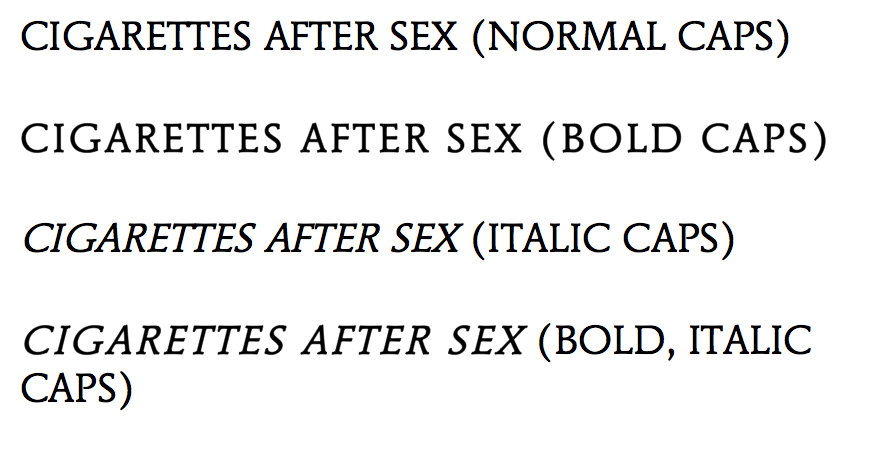
After the installation, I then started to play around with the font on Word; changing it from italic, to bold, to a combination of both - all in an effort to see which style of font worked best.
I deduced that the most effective way of utilising the style of font would be to keep it simple: just normal caps. Although, the idea of using the bold caps adds my own style to the DigiPak. In no way am I just being "lazy" and copying the actual style of font used, because as I've said, I want to maintain the band image and that continuity of the relationship between the ancillary products - so having a completely mis-matched font would be inappropriate. Ergo, I am justifying my reason for utilising the same font and same font style. However, in order to continuously develop my products, I will explore the standard font style, as well as the bold font style and decided which one is more effective - who knows, it may turn out that the bold would be the most effective, but for now, I am rigid in my intention of conveying the continuity between my products and the image of my band.
Further Inspiration and Exploration
Aside from finding the actual font used, I decided to broaden my options in terms of appropriate font styles. I took to a well known font website called "DaFont.com" and began my search there.
 As I am sticking closely to the image and genre of my band, I only focused on fonts that could potentially add to the "dream-pop" and grungy appeal - for example, Typewriter fonts.
The first font that I found, '1952 Rheinmetall', is a Typewriter font that hones in on the grungy appeal of the band. I did like this font as it is in keeping with a simple Serif style that ties in nicely with the overall aesthetic that I am trying to convey, and I will keep it in mind for the development of my ancillary products - however, I am not entirely sure I am convinced by it because of the minute gaps in the lettering. Although, it's not a huge problem, but when trying to put together a cohesive and professional looking product, you would tend to stray away from any unnecessary gaps such as this.
 In keeping with the genre of 'dream-pop', I researched alternative, "groovy" fonts that could potentially be appropriate for the DigiPak and magazine. I found a font called "Neon 80's", a style that has curved and smooth edges and is a Sans-Serif font. Overall, I almost like this look as it fits in well with the surrealist spin on the 'dream-pop' genre, but the font almost echoes a playful and jolly feel - something of which I am not really looking for. The band are known for their brooding tunes and if I were to use this font, I believe that audiences would get the wrong impression of the genre and the music itself. Without the Serifs on the lettering, it takes away from the edgy appeal of the band - again, something that I do not want to happen. However, on a positive, I love the continuity of the font - it is absent of any gaps (as compared to the font above) and offers smooth lines that could be appealing for the audience.
I moved on to explore the different types of font relating to the "Script" and Calligraphy category, in an effort to see the effect that widely alternative fonts could have in adding different meanings to the way in which the ancillary products are received.

Having thought I had found the most appropriate font style in "Bernadette", I quickly discovered that this isn't the look that I am going for at all. The font is too illegible and doesn't offer audiences ease when receiving the product. It doesn't work because the band name needs to be in all caps - this is to again, maintain the grunge-like appeal of the band, lowercase wouldn't necessarily work as it would look "too soft" for the image.
 Alternative Typewriter (Inspiration).
As you can see, I was inspired to explore alternative Typewriter fonts to see if this was an angle that I was going to pursue in my development and exploration. Out of the two that I have evidenced, I am leaning more towards the 'Linowrite' font, as the 'Modern Typewriter' has an element of distressing - a feature that I am going to include on both the magazine and DigiPak - ergo, too much of this distressing element could look messy and inappropriate. Overall, I am going to stick with a font that has evidence of Serifs, as this small and subtle feature adds so much dimension to the cover - as my DigiPak and magazine shall not be "flat".

I deduced that the most effective way of utilising the style of font would be to keep it simple: just normal caps. Although, the idea of using the bold caps adds my own style to the DigiPak. In no way am I just being "lazy" and copying the actual style of font used, because as I've said, I want to maintain the band image and that continuity of the relationship between the ancillary products - so having a completely mis-matched font would be inappropriate. Ergo, I am justifying my reason for utilising the same font and same font style. However, in order to continuously develop my products, I will explore the standard font style, as well as the bold font style and decided which one is more effective - who knows, it may turn out that the bold would be the most effective, but for now, I am rigid in my intention of conveying the continuity between my products and the image of my band.
 |
Aside from finding the actual font used, I decided to broaden my options in terms of appropriate font styles. I took to a well known font website called "DaFont.com" and began my search there.
 As I am sticking closely to the image and genre of my band, I only focused on fonts that could potentially add to the "dream-pop" and grungy appeal - for example, Typewriter fonts.
The first font that I found, '1952 Rheinmetall', is a Typewriter font that hones in on the grungy appeal of the band. I did like this font as it is in keeping with a simple Serif style that ties in nicely with the overall aesthetic that I am trying to convey, and I will keep it in mind for the development of my ancillary products - however, I am not entirely sure I am convinced by it because of the minute gaps in the lettering. Although, it's not a huge problem, but when trying to put together a cohesive and professional looking product, you would tend to stray away from any unnecessary gaps such as this.
 In keeping with the genre of 'dream-pop', I researched alternative, "groovy" fonts that could potentially be appropriate for the DigiPak and magazine. I found a font called "Neon 80's", a style that has curved and smooth edges and is a Sans-Serif font. Overall, I almost like this look as it fits in well with the surrealist spin on the 'dream-pop' genre, but the font almost echoes a playful and jolly feel - something of which I am not really looking for. The band are known for their brooding tunes and if I were to use this font, I believe that audiences would get the wrong impression of the genre and the music itself. Without the Serifs on the lettering, it takes away from the edgy appeal of the band - again, something that I do not want to happen. However, on a positive, I love the continuity of the font - it is absent of any gaps (as compared to the font above) and offers smooth lines that could be appealing for the audience.
I moved on to explore the different types of font relating to the "Script" and Calligraphy category, in an effort to see the effect that widely alternative fonts could have in adding different meanings to the way in which the ancillary products are received.

Having thought I had found the most appropriate font style in "Bernadette", I quickly discovered that this isn't the look that I am going for at all. The font is too illegible and doesn't offer audiences ease when receiving the product. It doesn't work because the band name needs to be in all caps - this is to again, maintain the grunge-like appeal of the band, lowercase wouldn't necessarily work as it would look "too soft" for the image.
 Alternative Typewriter (Inspiration).
As you can see, I was inspired to explore alternative Typewriter fonts to see if this was an angle that I was going to pursue in my development and exploration. Out of the two that I have evidenced, I am leaning more towards the 'Linowrite' font, as the 'Modern Typewriter' has an element of distressing - a feature that I am going to include on both the magazine and DigiPak - ergo, too much of this distressing element could look messy and inappropriate. Overall, I am going to stick with a font that has evidence of Serifs, as this small and subtle feature adds so much dimension to the cover - as my DigiPak and magazine shall not be "flat".

Friday, 6 January 2017
Magazine Advert Exploration
Cigarettes After Sex Magazine Exploration and Influence

Considering that Cigarettes After Sex are relatively new, searching for actual magazine adverts was slightly difficult, as they haven't been assigned to a major record label as of yet (they are a self-releasing band). However, I have managed to find posters that detail their Tour Dates that took place around the world last year and upcoming dates in 2017.
Aesthetically, the posters remain monochromatic; continuing on with the image of the band - simple, yet maintaining its "grunge" appeal. The one thing that I am influenced by is the simplicity of the posters, as the band have used continuity in iconography, such as the feather and hand; both of which have been used on album covers. If anything, in my final product for my magazine advertisement I will be keeping it relatively simple - yet captivating and presented in monochrome.
I really like the idea of the border that frames the poster, and I will experiment with and explore this feature as my development progresses. The reason why I am attracted to this feature so much, is that it adds a professional appeal; adding a level of quiet sophistication to the poster. When admiring the text of the poster, again, it is simple and sleek, but the actual band title is still in the same font over each poster evidenced in this post. Because of this, I will endeavour to find the actual font used by the band, or a font similar to it, and use it on my own product. Thus, continuously reflecting a relationship between each product (i.e. the DigiPak, music video and the magazine).

A feature that must be apparent on my poster is the use of a barcode or a QR code. Using a QR code is a simple way for a modernised audience to connect with the band and/or social media accounts that relate to the band. However, that being said, I still want to bring out the authenticity of the band, and considering that their music isn't necessarily "modern", the QR code doesn't entirely reflect their "grungy" or "gritty" image. But, for the sake of a modernised world, the QR code could work really well. Again, I will obviously test and explore my options and determine which scanning feature would look best. The only issue that I see with using the QR code, is that because it is quite bulky, it could detract from the simplicity that I am trying to convey, but until then, I'm not dismissing the possibility of using it.
Aside from this feature, I will also need to include the publishing information, possibly information pertaining to where the bands music can be found i.e. on Amazon, iTunes etc., songs included in the album, ratings from other magazines (i.e. NME) and the album information and/or name.
Fundamentally, the main feature that is going to reel the audience in would be the title of the band, ergo, the aim is to make the title as obvious as possible, but not garish or inappropriate; because as I said earlier, they're relatively new, so the idea is to get the name out to mass audiences so that a major fan base can be established and fame can be gained.

 Through researching alternative bands and their magazine adverts, I came across an advert for the band, 'The Verve'. The band are of similar genre and their music transcends into dream-pop and psychedelic rock. When analysing their magazine advert, it is clear that I can draw similarities between this advert and those for Cigarettes After Sex.
Firstly, it is clear that they have chosen to go down the simplistic route by using a sepia toned photograph of the sky and just the title of the band and the best single from the album. The choice of different colours for the texts is relevant, as this would have been done so that the audience focus more on the name of the band than the text at the bottom of the advert. Choosing to have the bottom text in white, means that the audience won't be distracted from the bold text situated in the centre of the advert. This advert is evidence of how simplicity is sometimes the better option, in terms of engaging audiences, instead of bombarding them with information that they would more than likely skip over. Placement of the text is also very specific. Having the name of the band in the centre of the poster suggests (although a quite literal interpretation) that they want to be at the centre of attention and the band that you should be paying attention to. It also suggests the quiet and subtle confidence of the band, because by placing the name of the band in the centre, it suggests that they are comfortable with the position that they're in - in terms of fame. They're almost oxymoronically "loud" with their quiet confidence - but that's taking analysis to another level.
They have strategically used the same font as seen on all of their CD's and the font that is specific and unique to their band. They've almost used the font as the iconography for the band, as this particular style of font is quite recognisable to their fanbase and any other audiences that may not directly engage with the band and their music.
The choice of image is also very interesting, because if I were to relate it to the genre of music, the clouds and the sky evoke feelings of tranquility and ethereal power, as subconsciously, the audience could be led to assume that they could be the ones to experience these feelings if they were to listen to their music. Compared to Cigarettes After Sex, The Verve's advert includes the record label that the band is assigned to and how the album 'Forth', is available on vinyl.
Ultimately, I have decided that simplicity is the best way forward and I will draw on elements from previous posters for Cigarettes After Sex, and experiment with different filters, such as the sepia toned photograph as evidenced in the poster for The Verve. However, as I want to create cohesion between all of my ancillary products, I am also going to transfer a distressed and etched look onto the magazine advert, as this is what will be represented on the DigiPak covers.
Thursday, 5 January 2017
DigiPak Intentions for Cigarettes After Sex
Intentions for Cigarettes After Sex DigiPak
The intention for my own DigiPak for Cigarettes After Sex is that of combining inspiration from my research into alternative DigiPaks within the same genre, and my own photography. I was particularly inspired by Daughter's scratch, etching and distressed look as well as My Bloody Valentine's overlay technique. Combining the elements of these two in particular, I have conjured up an idea of what I want my final product to look like.

The overall aesthetic of my DigiPak will reflect my own interpretation of the song, with influences from prior album covers as well as inspiration from the external research I have conducted. Based off their prior album covers, I am going to ensure that I create a distressed and grungy look and incorporate elements of film grain or a burnt out film tape/photograph (used as an overlay) to mirror my interpretation of reminiscing and nostalgia of distant memories. This way, I know I am maintaining that link and I have evidenced a level of continuity between the music video, my interpretation, the band and the genre.

Compared to the other influences, I will be ensuring that the name of the band is at the forefront of the DigiPak, as I believe that although they're an up and coming band, I would want to maintain that level of interaction with audiences, and I would do this by ensuring that the name is at the forefront of the DigiPak and in an appropriate font and size. To maintain the links with the music video, I will consider using a transparent overlay of flames on the album cover as well, as this holds symbolic value within my video and reiterates that relationship.

DigiPak Exploration, Inspiration and Analysis
DigiPak Exploration, Inspiration and Analysis
Typical Codes and Conventions of a DigiPak
The general codes and conventions of a DigiPak and/or CD cover are as follows:
- Appropriate font and text size
- Correct and accurate register and language
- Barcode, publishing and copyrighting information (noted on the back cover)
- A continuous relationship between the band iconography and their product
- A track list
Daughter, 'Not To Disappear' (Dream-Pop/Indie)

The album cover for Daughters, 'Not To Disappear' is not limited in its colour palette and features an amalgamation of pastel colours that have been etched and scratched to mimic a distressed look. There is no mention of the bands name on the front of the album cover, however, it is only on the back alongside the track list. The aesthetic of the album continues onto the back side of the CD case, but doesn't flourish with the same amount of colour as it did on the front - the look changes to a more subdued and grungy appeal due to the lack of colour.
Considering the album name, 'Not To Disappear' and comparing it to the chosen aesthetic of the CD cover, could be connoted with the idea of space and the outer world, as the scratch marks and distressing of the paint morph into surreal shapes and lines, and a continuation of a deep blue follows onto the back cover. A solitary yellow mark could be representative of a planet or a person lost in the external world of space; perhaps mirroring an expanse of a subconscious - ergo, lost in their own mind. Having heard the songs on the album, this isn't a far stretch as the songs speak of identity loss and becoming lost in your own mind.

Font size and choice is an integral part of any CD cover and DigiPak. The choice for a simple and sleek font on this CD cover conforms to what you would see on an album cover concerning an artist within the realm of the dream-pop or indie genre. The smoothness of the font and size is aesthetically pleasing and doesn't detract from the illustration on the cover. Although, the all-caps adds an edge of harshness to the overall look of the cover. Using a barcode in the bottom left-hand corner allows people to purchase the CD and also makes the CD eligible for sale. The CD also features the copyright and publishing information, positioned next to the barcode. This informs people of the producing and recording companies, and suggests that the CD could not be copied and sold for alternative purposes.
I am inspired to use an aesthetic like this as the distressed look of the album covers could translate to the intricate workings of a relationship. Obviously, the colours would change and perhaps lean more towards striking colours such as a deep red or purple, instead of using pastel colours. In relation to my music video, the aesthetic of my footage is gritty and edited with cool coloured hues and this was done to fit the genre of 'dream-pop' and the overall aesthetic of my chosen band.
My Bloody Valentine, 'Loveless'(Dream-Pop & Rock)

This album cover is considerably different to the aforementioned. Compared to Daughters album cover, this cover details more of a psychedelic element to it, reeling the audience in with a vibrant, digitalised magenta colour. It also features a very prominent image of a guitar, following the code and convention of a rock band. The tilt-shifted appeal of the CD cover offers a simplistic yet captivating image for the audience to engage with; with the bright colour being the central focus.
What is interesting to note is that there is no capitalisation of any word throughout the entirety of this CD package; perhaps offering a cleaner and softer appeal to the look instead of utilising harsh capitalisation. The font is also smoothed and curved, and doesn't resemble any harsh fonts that you would typically find on a rock genre CD cover. Compared to the front, the back of the CD cover is a binary opposite colour; a pastel off-blue, yet. Considering that My Bloody Valentine is a well known rock and dream-pop band, the tilt-shifted glow of the guitar conforms to the genre of dream-pop, whereas they still maintain the iconography of the rock genre by using the electric guitar. Here, we can see a convergence of codes and conventions of two widely different genres.

It is interesting to note that they haven't mentioned the album name, which is 'Loveless' and haven't included the barcode on the back cover. This could have been done because of a worldwide distribution; thus, the barcode may have been stuck on, instead of being included in the final print. Although, this is highly unusual as every single artist or band when releasing a CD must have the barcode, publishing and copyrighting information on the back cover.
If I were to take inspiration from this CD cover, it would be the use of the tilt-shift, but no so much the glow of the iconography, as I feel this wouldn't fit in with my overall aesthetic of my music video - it would be too dreamlike and soft. In one of my previous posts, I included potential photographs (my own) that could be included on the DigiPak. These photographs were the hands of my mother and father and showed their wedding rings at the forefront of the image. Perhaps, I could tilt-shift that image and use the inspiration from Daughters album cover (the distressed paint and scratching) to lay over the top of the image. However, I would include the artists name and the album name on the front and the spine of the DigiPak - something that Daughter didn't do.
Still Corners, 'Strange Pleasures' (Dream-Pop & Psychedelic Pop)

This album cover represents both the psychedelic and dream-pop genre of the band, 'Still Corners'. The most notable feature of this album cover is the vibrant, digitalised colouring of the desert which has then had an overlay of wispy clouds added to it. This certainly adds an element of surrealism to the artwork. In keeping with their genre, the scripture that is used for the name of the band and the name of the album, is almost illegible, but is entirely associated with messy, handwritten font, again, adding the appeal of the "carefreeness" that is associated with the two genres.
Inside the DigiPak, the track list is revealed. The track list is printed using a sans serif font and brings back the "put together" look of the album that was perhaps taken away with the almost illegible writing on the front of the album cover.

There is a continuation of the psychedelic colour scheme that follows through onto the inside of the DigiPak and onto the back cover. However, on the inside of the DigiPak, it can be noted that the blue hasn't been consistent and has been replaced with a dull, deep red. This was probably done as the constant of blue throughout the entire package would have been overbearing and detracted from the track list that remains on the inside cover.
The publishing and copyrighting license is noted on the inside cover of the DigiPak and can be seen on the lower left-hand corner of the inside page. To complete the entire packaging, the band have also decorated and illustrated the actual CD, using reference from the original front cover of the album. This is so that there is a continued theme and aesthetic and reinforces the psychedelic genre of the band.
Although this packaging reflects the vibrancy of the dream-pop and psychedelic genre, I wouldn't include this much colour into my work as this doesn't reflect my own personal interpretation, nor does it reflect the mood that I am trying to convey in the video. The only element that I would consider taking from this DigiPak, would be the overlays.
M83, 'Hurry Up, We're Dreaming' (Ambient Pop/Dream-Pop)
 Upon first glance, this album cover uses dull digitalised colours, such as the magenta, green and cyan in a peculiar setting. Looking closer, you can tell that the colours have been through an overlay process in which the colours start to merge to create a sort of kaleidoscopic mirage, which in turn, reinforces and conforms to the ambient pop genre. The text is bold and obvious, immediately drawing someone to the name of the artist; the same can also be said about the album title. However, it is an interesting choice to take away spaces between the words and condense the title together. I believe this was effective and worked well because of the bold and regular font segregation, otherwise the text would have looked flat and unprofessional. When reading the album title, you are naturally drawn to the "Hurry Up" in bold and personally, I read it with a harsher intonation and emphasise this part of the album title. Subconsciously, this actually makes me want to listen to the album more and it's as if the artist is trying to usher audiences to "hurry up" and listen to the album. I tested this theory of mine on my parents and my sister. I asked them how they would read the title and they all said that they would definitely put more emphasis on the "hurry up" - so it wasn't a total stretch. The album cover in itself if entirely ambiguous and features three enigmatic characters that audiences would struggle to relate to, thus, creating an enigma as we wonder if these characters are prevalent throughout music videos or part of the band and it's image (used as iconography).
 Looking at the back and spine of the album cover, the track list is clear and has a clean, professional look to it. The publishing information and copyright information is evident as well, as it is situated next to the barcode. If there was one criticism I could make about this album cover, it would be the confusion about the separation of the songs by the bold numbers in the middle. .
On the inside of the DigiPak, there are photographs that feature the band and their performances, as well as their logo. Since M83 are an ambient-pop group, they are commonly associated with everything to do with space and the outer galaxy and this is reinforced because of their popular surreal and ambient music. There is an image of a galaxy on the far right section of the DigiPak that continues onto the actual CD along with the name of the band. All in all, there is a clear colour aesthetic throughout the entire packaging and the artwork maintains its deep purple and magenta hues.

Purity Ring, 'Another Eternity' (Dream-Pop/Synth-Pop)
 This is yet another album cover that toys with simplicity and pastel colours; both elements work effectively in conveying the genre of the band. The singular woman that is obviously suspended in the air evokes a feeling of the ability to dream, shifting through time and getting lost in the world of music, and upon hearing their music, I definitely agree with the latter. The sounds that Purity Ring focus on is that of an upbeat, yet oddly calming tempo with moments of surreal melodies; allowing your mind to wander. Dressed in a white sheer dress, the suspended woman reinforces the bands image of being "pure" etc. as typically, in Colour Psychology, the colour white is often associated with virgin-like qualities and the art of being "pure". Another notable feature to the front of the album cover is that of the rather obvious pink circle that is detailed with a range of intricate lines and patterns. A rather obvious observation that can be made is the fact that the band haven't included their name anywhere on the album cover and DigiPak - perhaps, as stated before, this was done as they want to keep their image "low-key" but still continue to make their music.
 Turning to the back of the album cover, you are instantly drawn to the four symbols at the top of the cover. The only obvious one that I can identify is that of the moth located second to the right, the others are left totally ambiguous and could be considered the emblems that are used as iconography for the band and their fan base.
As always, the track list features on the back in clean, uppercase font; adding to the overall sleek aesthetic of the DigiPak. It includes the licensing agreements but also the location of the producing studio that seems to be in London. Again, the barcode is featured making it eligible for purchase.
In terms of representation of the band, the colour palette seems to relate to their idea of "purity" and the DigiPak is devoid of digitalised colours and features a pastel pink throughout. Looking below, the unfolded card also has the pastel pink colour, but it is obvious that there is a gradient or ombre effect to the colouring.

Throughout the research of different DigiPaks and album art throughout the genre of dream-pop, psychedelic-pop and ambient-pop, I have gained a lot of influence and inspiration that I could include in my final products.
Audience Feedback Podcast1
Audience Feedback for First "Rough" Cut
To gauge my success throughout the course, I will have to continuously ask for feedback from my target audience to see if I can improve in any areas to maximise my marks, whilst also receiving positive feedback. For the purposes of this, I will be gathering soundbites and a compilation of Facebook comments from my friends after having watched the first cut of the video.
Wednesday, 4 January 2017
Call Sheet with Times in M.V.
Call Sheet (with timings incl.)
Here, I have included a table for the 'Call Sheet' detailing the process of filming for my music video. Within this table there is also the information for the timing of the frames and when they are featured within the music video. It also includes the personnel that were involved in the filming, the dates and the specific time, location, the plan,
shot type and shot description.


Subscribe to:
Posts (Atom)