Typography
Choosing a font for any purpose is integral in shaping a way that the text is received by audiences. So, my font selection for my DigiPak and magazine is no different. Ultimately, I want to sustain the relationship between each and every ancillary product that I produce, but also relate it back to the image of the band.
Firstly, I took to the Internet and conducted a font search because I was adamant that I want to use the actual font that my band use on each of their products; especially the font used on their album covers. I found a website called "WhatTheFont.com" and ran an image through their font database. The website then isolated each letter (I filled in the letters that were unable to be recognised) and then I let the search run it's course. After about 30 seconds, I am greeted with a screen that displayed five fonts that were closely matched to the original image that I had uploaded.

Honestly, the five fonts looked exactly the same and didn't really have much difference to them. So, choosing the first font that came up (because naturally, I assumed that the first would be the closest match - I was right!) I then perused the Internet yet again for a source that would help me to download the font - as my Microsoft Office account didn't have the font installed.
I found a very helpful website that allowed me to download the font for free, and after much reconfiguring with my Microsoft Office account and Word, I finally installed the font 'ITC Mendoza Roman Book SC'.

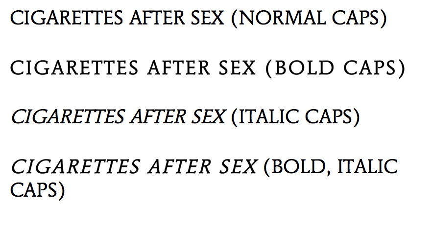
After the installation, I then started to play around with the font on Word; changing it from italic, to bold, to a combination of both - all in an effort to see which style of font worked best.
I deduced that the most effective way of utilising the style of font would be to keep it simple: just normal caps. Although, the idea of using the bold caps adds my own style to the DigiPak. In no way am I just being "lazy" and copying the actual style of font used, because as I've said, I want to maintain the band image and that continuity of the relationship between the ancillary products - so having a completely mis-matched font would be inappropriate. Ergo, I am justifying my reason for utilising the same font and same font style. However, in order to continuously develop my products, I will explore the standard font style, as well as the bold font style and decided which one is more effective - who knows, it may turn out that the bold would be the most effective, but for now, I am rigid in my intention of conveying the continuity between my products and the image of my band.
Further Inspiration and Exploration
Aside from finding the actual font used, I decided to broaden my options in terms of appropriate font styles. I took to a well known font website called "DaFont.com" and began my search there.
 As I am sticking closely to the image and genre of my band, I only focused on fonts that could potentially add to the "dream-pop" and grungy appeal - for example, Typewriter fonts.
The first font that I found, '1952 Rheinmetall', is a Typewriter font that hones in on the grungy appeal of the band. I did like this font as it is in keeping with a simple Serif style that ties in nicely with the overall aesthetic that I am trying to convey, and I will keep it in mind for the development of my ancillary products - however, I am not entirely sure I am convinced by it because of the minute gaps in the lettering. Although, it's not a huge problem, but when trying to put together a cohesive and professional looking product, you would tend to stray away from any unnecessary gaps such as this.
 In keeping with the genre of 'dream-pop', I researched alternative, "groovy" fonts that could potentially be appropriate for the DigiPak and magazine. I found a font called "Neon 80's", a style that has curved and smooth edges and is a Sans-Serif font. Overall, I almost like this look as it fits in well with the surrealist spin on the 'dream-pop' genre, but the font almost echoes a playful and jolly feel - something of which I am not really looking for. The band are known for their brooding tunes and if I were to use this font, I believe that audiences would get the wrong impression of the genre and the music itself. Without the Serifs on the lettering, it takes away from the edgy appeal of the band - again, something that I do not want to happen. However, on a positive, I love the continuity of the font - it is absent of any gaps (as compared to the font above) and offers smooth lines that could be appealing for the audience.
I moved on to explore the different types of font relating to the "Script" and Calligraphy category, in an effort to see the effect that widely alternative fonts could have in adding different meanings to the way in which the ancillary products are received.

Having thought I had found the most appropriate font style in "Bernadette", I quickly discovered that this isn't the look that I am going for at all. The font is too illegible and doesn't offer audiences ease when receiving the product. It doesn't work because the band name needs to be in all caps - this is to again, maintain the grunge-like appeal of the band, lowercase wouldn't necessarily work as it would look "too soft" for the image.
 Alternative Typewriter (Inspiration).
As you can see, I was inspired to explore alternative Typewriter fonts to see if this was an angle that I was going to pursue in my development and exploration. Out of the two that I have evidenced, I am leaning more towards the 'Linowrite' font, as the 'Modern Typewriter' has an element of distressing - a feature that I am going to include on both the magazine and DigiPak - ergo, too much of this distressing element could look messy and inappropriate. Overall, I am going to stick with a font that has evidence of Serifs, as this small and subtle feature adds so much dimension to the cover - as my DigiPak and magazine shall not be "flat".

I deduced that the most effective way of utilising the style of font would be to keep it simple: just normal caps. Although, the idea of using the bold caps adds my own style to the DigiPak. In no way am I just being "lazy" and copying the actual style of font used, because as I've said, I want to maintain the band image and that continuity of the relationship between the ancillary products - so having a completely mis-matched font would be inappropriate. Ergo, I am justifying my reason for utilising the same font and same font style. However, in order to continuously develop my products, I will explore the standard font style, as well as the bold font style and decided which one is more effective - who knows, it may turn out that the bold would be the most effective, but for now, I am rigid in my intention of conveying the continuity between my products and the image of my band.
 |
Aside from finding the actual font used, I decided to broaden my options in terms of appropriate font styles. I took to a well known font website called "DaFont.com" and began my search there.
 As I am sticking closely to the image and genre of my band, I only focused on fonts that could potentially add to the "dream-pop" and grungy appeal - for example, Typewriter fonts.
The first font that I found, '1952 Rheinmetall', is a Typewriter font that hones in on the grungy appeal of the band. I did like this font as it is in keeping with a simple Serif style that ties in nicely with the overall aesthetic that I am trying to convey, and I will keep it in mind for the development of my ancillary products - however, I am not entirely sure I am convinced by it because of the minute gaps in the lettering. Although, it's not a huge problem, but when trying to put together a cohesive and professional looking product, you would tend to stray away from any unnecessary gaps such as this.
 In keeping with the genre of 'dream-pop', I researched alternative, "groovy" fonts that could potentially be appropriate for the DigiPak and magazine. I found a font called "Neon 80's", a style that has curved and smooth edges and is a Sans-Serif font. Overall, I almost like this look as it fits in well with the surrealist spin on the 'dream-pop' genre, but the font almost echoes a playful and jolly feel - something of which I am not really looking for. The band are known for their brooding tunes and if I were to use this font, I believe that audiences would get the wrong impression of the genre and the music itself. Without the Serifs on the lettering, it takes away from the edgy appeal of the band - again, something that I do not want to happen. However, on a positive, I love the continuity of the font - it is absent of any gaps (as compared to the font above) and offers smooth lines that could be appealing for the audience.
I moved on to explore the different types of font relating to the "Script" and Calligraphy category, in an effort to see the effect that widely alternative fonts could have in adding different meanings to the way in which the ancillary products are received.

Having thought I had found the most appropriate font style in "Bernadette", I quickly discovered that this isn't the look that I am going for at all. The font is too illegible and doesn't offer audiences ease when receiving the product. It doesn't work because the band name needs to be in all caps - this is to again, maintain the grunge-like appeal of the band, lowercase wouldn't necessarily work as it would look "too soft" for the image.
 Alternative Typewriter (Inspiration).
As you can see, I was inspired to explore alternative Typewriter fonts to see if this was an angle that I was going to pursue in my development and exploration. Out of the two that I have evidenced, I am leaning more towards the 'Linowrite' font, as the 'Modern Typewriter' has an element of distressing - a feature that I am going to include on both the magazine and DigiPak - ergo, too much of this distressing element could look messy and inappropriate. Overall, I am going to stick with a font that has evidence of Serifs, as this small and subtle feature adds so much dimension to the cover - as my DigiPak and magazine shall not be "flat".


