Showing posts with label analysis. Show all posts

Monday, 16 January 2017

Music Video Analysis: Daughter - Numbers


Music Video Analysis: Daughter - Numbers

Directed by Iain Forsyth and Jane Pollard, the music video for 'Numbers' is that of a conceptual piece that doesn't really bare any relation to the lyrics. Instead, I believe it is more of a social commentary of social identity and growing up in a modernised society - both commenting on how the world is cruel, warped and in some cases distorted, as well as commenting on how people exist through what they perceive to be as "perpetual pain". 

RELATIONSHIP BETWEEN LYRICS AND VISUALS

Overall, I could make no distinctive link between the lyrics and the visuals, purely because there were no objects or motifs that solely related to what the song entailed. However, with this being said, the concept of being "numb" was highly evident, as shown through a variety of wide angled and tracking shots that showed the lack of emotion of the lead actress, Natasha O'Keefe. Although the video is conceptual, there are elements of performance within the music video; as seen through wide angled camera shots of a band (the lead singer an old man, and the actual singer of the band 'Daughter', acting as a bassist) performing under brooding, low-key lighting. In this sense, I can make a link between the visuals and lyrics, as there is an obvious element of lip-synching: a convention of a performance style music video. 

GENRE CHARACTERISTICS

Upon first watching the video and already knowing that 'Daughter' is an ambient pop and dream pop group, the music video definitely conformed to the codes and conventions of the genre. For starters, the genre of dream-pop tends to add an element of subtle surrealism to any product. In terms of this music video having an element of "surrealism" to it, it makes the audience question things that inevitably evokes a response from audiences that force them to question the aesthetics of the video, as well as the deeper, perhaps didactic meaning of the product. As my aforementioned point states, the video draws heavily on how we live vicariously through a modernised society, constantly changing our personal identity to suit that of the agenda of the time - yet, we're possibly unaware of the damaging effects that it has on us. An obvious convention of a dream-pop music video is the vast amount of low-key, cool-hued lighting, that in turn evokes a melancholic response from the audience as well as suiting the overall aesthetic. In contrast to this, there were also moments captured within the video (exhibited through wide-angled and tracking shots) that showed neon, vibrant, high-key lighting that had a soft glow to it - reinforcing the genre convention of ambient-pop, as the soft glow of the neon lights added another dimension to the visuals, drawing the audience in and reiterating the atmospheric and brooding tone of the video. The directorial choice of not using quick-cut edited shots also conforms to the genre of dream-pop, as the smooth, continuous tracking shots reiterate a gentle flow throughout the video, adding continuity and allowing audiences to engage more with the genre of ambient-pop

LINEAR OR CLOSED NARRATIVE?

In this music video, there is a strong narrative that unfolds throughout the main body of the product - however, personally, it seems a little complex for audiences to fully engage with. The excessive amounts of enigma codes, such as the close-up shots of the deck of cards and the coin, pique audience interest, but makes them work harder in unearthing the narrative. Having watched the video numerous times, it is clear that there is a continuous narrative that flows throughout, but it is also a cyclical narrative, as it opens with a wide-angled camera shot of an apartment bedroom, and ends in the same way - suggesting that the narrative that the actress takes is both continuous and part of her twisted, deluded every day life. The music video is particularly interesting because as we follow the actress throughout the concealed streets of London, the camera directs our attention to several different people, such as the protesters, the homeless man and the woman that injured herself. In terms of a directorial choice, it could be inferred that the woman detaches herself from these things that she deems as "mundane" and unimportant - as she dismissively blows smoke into the faces of the protesters, lighting money on fire and tossing it at the homeless man and finally completely ignoring the injured girl. 

LOOKING/MODE OF ADDRESS

Deducing that the music video is in fact conceptual and isn't performance based, there is an absence of looking throughout the video, but only up until the very end where the lead singer of the band is shown through an extreme close-up and lip-synchs to the camera. Up until this point, the actress, Natasha O'Keefe, remains completely distant to the audience, showing her detachment through the same, nonchalant and emotionless facial expression. The idea of the actress distancing herself from the audience by failing to look directly at the camera, reinforces the message that I decoded from the video - she shows that she is perpetually numb and the lack of acknowledgment of the audience and camera, shows the lack of confidence that she has in herself and her personal identity. Perhaps, she also views the audience as being "mundane" and refuses to acknowledge us because of this - just as she did with the injured girl. 

MIS-EN-SCENE

Conceptually driven, the music video focuses on a girl and her struggle with personal identity and love in a world that does nothing but take from her, and only stresses that it is indeed a cruel world - as seen through the various other characters. The only way that she finds comfort in the world is taking from other people, hence the strong enigma codes of the deck of cards. Various close-up camera shots of the deck of cards, suggests that this is only a game to her; she is calculated and methodical in what she wants, and knows exactly how to get it. She seeks and she takes - relentlessly.  This is the only way to get back at the world from taking her personal identity from her. Considering that she dons a red, satin/silk dress, conjures up imagery of the stock character, the 'Femme Fatale'. Used in a lot of movies and music videos, the 'Femme Fatale' is typically depicted as a beautiful woman with bad intentions; usually to capture lovers. The element of Colour Psychology is again used here, with the colour red usually associated with love, danger, blood and death. O'Keefe searches for men to use and drain of life, with the death of the men happening right after she touches the deck of cards and the coin, and the men being drained of blood. The idea that she touches the deck of cards, shown entirely through high-angled close-up shots, suggests that she knows that she is playing a dangerous game, but this doesn't bother her, as she gets what she wants anyway. The video intimates that life is nothing but a game and a competition and suggests that life is fragile if put into the wrong hands.

The low-key lighting of the video allows for an emotive response from the audience as it follows the harrowing tone of the visuals. In terms of empowerment and disempowerment, there was really no inference that I could make here, as although there were no high-angled or low-angled camera shots of the main actress, it was clear that she remained in a position of power as she was the central figure-head in the music video. The only power inference that I could make would be that of the high-angled shot of the deck of cards and how the woman would always be in a position of power if she continued to play the game of life and death.




Sunday, 8 January 2017

Typography for the DigiPak and Magazine


Typography

Choosing a font for any purpose is integral in shaping a way that the text is received by audiences. So, my font selection for my DigiPak and magazine is no different. Ultimately, I want to sustain the relationship between each and every ancillary product that I produce, but also relate it back to the image of the band. 

Firstly, I took to the Internet and conducted a font search because I was adamant that I want to use the actual font that my band use on each of their products; especially the font used on their album covers.  I found a website called "WhatTheFont.com" and ran an image through their font database. The website then isolated each letter (I filled in the letters that were unable to be recognised) and then I let the search run it's course. After about 30 seconds, I am greeted with a screen that displayed five fonts that were closely matched to the original image that I had uploaded.

Honestly, the five fonts looked exactly the same and didn't really have much difference to them. So, choosing the first font that came up (because naturally, I assumed that the first would be the closest match - I was right!) I then perused the Internet yet again for a source that would help me to download the font - as my Microsoft Office account didn't have the font installed. 

I found a very helpful website that allowed me to download the font for free, and after much reconfiguring with my Microsoft Office account and Word, I finally installed the font 'ITC Mendoza Roman Book SC'. 


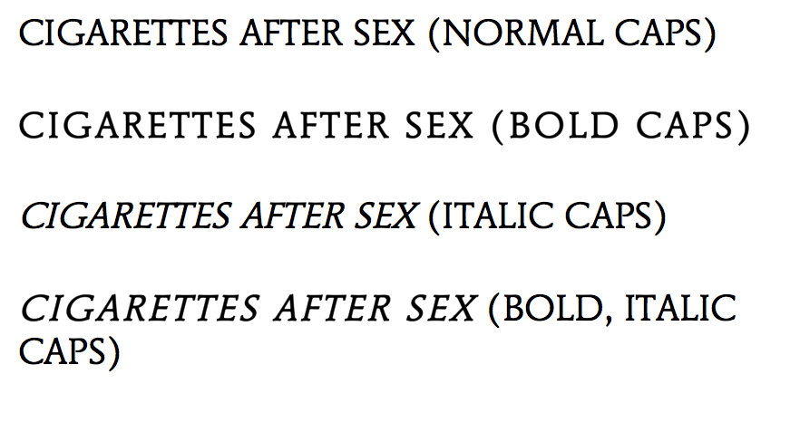
After the installation, I then started to play around with the font on Word; changing it from italic, to bold, to a combination of both - all in an effort to see which style of font worked best.

I deduced that the most effective way of utilising the style of font would be to keep it simple: just normal caps. Although, the idea of using the bold caps adds my own style to the DigiPak. In no way am I just being "lazy" and copying the actual style of font used, because as I've said, I want to maintain the band image and that continuity of the relationship between the ancillary products - so having a completely mis-matched font would be inappropriate. Ergo, I am justifying my reason for utilising the same font and same font style. However, in order to continuously develop my products, I will explore the standard font style, as well as the bold font style and decided which one is more effective - who knows, it may turn out that the bold would be the most effective, but for now, I am rigid in my intention of conveying the  continuity between my products and  the image of my band.


Further Inspiration and Exploration

Aside from finding the actual font used, I decided to broaden my options in terms of appropriate font styles. I took to a well known font website called "DaFont.com" and began my search there.

As I am sticking closely to the image and genre of my band,  I only focused on fonts that could potentially add to the "dream-pop" and grungy appeal - for example, Typewriter fonts.

The first font that I found, '1952 Rheinmetall', is a Typewriter font that hones in on the grungy appeal of the band. I did like this font as it is in keeping with a simple Serif style that ties in nicely with the overall aesthetic that I am trying to convey, and I will keep it in mind for the development of my ancillary products - however, I am not entirely sure I am convinced by it because of the minute gaps in the lettering. Although, it's not a huge problem, but when trying to put together a cohesive and professional looking product, you would tend to stray away from any unnecessary gaps such as this.

In keeping with the genre of 'dream-pop', I researched alternative, "groovy" fonts that could potentially be appropriate for the DigiPak and magazine. I found a font called "Neon 80's", a style that has curved and smooth edges and is a Sans-Serif font. Overall, I almost like this look as it fits in well with the surrealist spin on the 'dream-pop' genre, but the font almost echoes a playful and jolly feel - something of which I am not really looking for. The band are known for their brooding tunes and if I were to use this font, I believe that audiences would get the wrong impression of the genre and the music itself. Without the Serifs on the lettering, it takes away from the edgy appeal of the band - again, something that I do not want to happen. However, on a positive, I love the continuity of the font - it is absent of any gaps (as compared to the font above) and offers smooth lines that could be appealing for the audience.

I moved on to explore the different types of font relating to the "Script" and Calligraphy category, in an effort to see the effect that widely alternative fonts could have in adding different meanings to the way in which the ancillary products are received.


Having thought I had found the most appropriate font style in "Bernadette", I quickly discovered that this isn't the look that I am going for at all. The font is too illegible and doesn't offer audiences ease when receiving the product. It doesn't work because the band name needs to be in all caps - this is to again, maintain the grunge-like appeal of the band, lowercase wouldn't necessarily work as it would look "too soft" for the image.

Alternative Typewriter (Inspiration).

As you can see, I was inspired to explore alternative Typewriter fonts to see if this was an angle that I was going to pursue in my development and exploration. Out of the two that I have evidenced, I am leaning more towards the 'Linowrite' font, as the 'Modern Typewriter' has an element of distressing - a feature that I am going to include on both the magazine and DigiPak - ergo, too much of this distressing element could look messy and inappropriate. Overall, I am going to stick with a font that has evidence of Serifs, as this small and subtle feature adds so much dimension to the cover - as my DigiPak and magazine shall not be "flat".


Thursday, 5 January 2017

DigiPak Exploration, Inspiration and Analysis


DigiPak Exploration, Inspiration and Analysis

Typical Codes and Conventions of a DigiPak

The general codes and conventions of a DigiPak and/or CD cover are as follows:
  • Appropriate font and text size
  • Correct and accurate register and language
  • Barcode, publishing and copyrighting information (noted on the back cover)
  • A continuous relationship between the band iconography and their product 
  • A track list

Daughter, 'Not To Disappear' (Dream-Pop/Indie)


The album cover for Daughters, 'Not To Disappear' is not limited in its colour palette and features an amalgamation of pastel colours that have been etched and scratched to mimic a distressed look. There is no mention of the bands name on the front of the album cover, however, it is only on the back alongside the track list. The aesthetic of the album continues onto the back side of the CD case, but doesn't flourish with the same amount of colour as it did on the front - the look changes to a more subdued and grungy appeal due to the lack of colour. 

Considering the album name, 'Not To Disappear' and comparing it to the chosen aesthetic of the CD cover, could be connoted with the idea of space and the outer world, as the scratch marks and distressing of the paint morph into surreal shapes and lines, and a continuation of a deep blue follows onto the back cover. A solitary yellow mark could be representative of a planet or a person lost in the external world of space; perhaps mirroring an expanse of a subconscious - ergo, lost in their own mind. Having heard the songs on the album, this isn't a far stretch as the songs speak of identity loss and becoming lost in your own mind. 

The choice not to have the artists name on the front cover leaves a sense of ambiguity and could possibly draw the audience into seeking the artist. Having researched the other album covers for the artist, it is interesting to note that the artist doesn't present herself on any of the covers, but instead uses pictures of children and a swooping piece of fabric. I believe that the choice to do this would stem from the fact that the artist isn't looking for popularity and fame by projecting her image for mass audiences, but instead finds comfort in producing beautiful music.

Font size and choice is an integral part of any CD cover and DigiPak. The choice for a simple and sleek font on this CD cover conforms to what you would see on an album cover concerning an artist within the realm of the dream-pop or indie genre. The smoothness of the font and size is aesthetically pleasing and doesn't detract from the illustration on the cover. Although, the all-caps adds an edge of harshness to the overall look of the cover. Using a barcode in the bottom left-hand corner allows people to purchase the CD and also makes the CD eligible for sale. The CD also features the copyright and publishing information, positioned next to the barcode. This informs people of the producing and recording companies, and suggests that the CD could not be copied and sold for alternative purposes.

I am inspired to use an aesthetic like this as the distressed look of the album covers could translate to the intricate workings of a relationship. Obviously, the colours would change and perhaps lean more towards striking colours such as a deep red or purple, instead of using pastel colours. In relation to my music video, the aesthetic of my footage is gritty and edited with cool coloured hues and this was done to fit the genre of 'dream-pop' and the overall aesthetic of my chosen band.

My Bloody Valentine, 'Loveless'(Dream-Pop & Rock)


This album cover is considerably different to the aforementioned. Compared to Daughters album cover, this cover details more of a psychedelic element to it, reeling the audience in with a vibrant, digitalised magenta colour. It also features a very prominent image of a guitar, following the code and convention of a rock band. The tilt-shifted appeal of the CD cover offers a simplistic yet captivating image for the audience to engage with; with the bright colour being the central focus. 

What is interesting to note is that there is no capitalisation of any word throughout the entirety of this CD package; perhaps offering a cleaner and softer appeal to the look instead of utilising harsh capitalisation. The font is also smoothed and curved, and doesn't resemble any harsh fonts that you would typically find on a rock genre CD cover. Compared to the front, the back of the CD cover is a binary opposite colour; a pastel off-blue, yet. Considering that My Bloody Valentine is a well known rock and dream-pop band, the tilt-shifted glow of the guitar conforms to the genre of dream-pop, whereas they still maintain the iconography of the rock genre by using the electric guitar. Here, we can see a convergence of codes and conventions of two widely different genres. 

It is interesting to note that they haven't mentioned the album name, which is 'Loveless' and haven't included the barcode on the back cover. This could have been done because of a worldwide distribution; thus, the barcode may have been stuck on, instead of being included in the final print. Although, this is highly unusual as every single artist or band when releasing a CD must have the barcode, publishing and copyrighting information on the back cover. 

If I were to take inspiration from this CD cover, it would be the use of the tilt-shift, but no so much the glow of the iconography, as I feel this wouldn't fit in with my overall aesthetic of my music video - it would be too dreamlike and soft. In one of my previous posts, I included potential photographs (my own) that could be included on the DigiPak. These photographs were the hands of my mother and father and showed their wedding rings at the forefront of the image. Perhaps, I could tilt-shift that image and use the inspiration from Daughters album cover (the distressed paint and scratching) to lay over the top of the image. However, I would include the artists name and the album name on the front and the spine of the DigiPak - something that Daughter didn't do.


Still Corners, 'Strange Pleasures' (Dream-Pop & Psychedelic Pop)

This album cover represents both the psychedelic and dream-pop genre of the band, 'Still Corners'. The most notable feature of this album cover is the vibrant, digitalised colouring of the desert which has then had an overlay of wispy clouds added to it. This certainly adds an element of surrealism to the artwork. In keeping with their genre, the scripture that is used for the name of the band and the name of the album, is almost illegible, but is entirely associated with messy, handwritten font, again, adding the appeal of the "carefreeness" that is associated with the two genres. 

Inside the DigiPak, the track list is revealed. The track list is printed using a sans serif font and brings back the "put together" look of the album that was perhaps taken away with the almost illegible writing on the front of the album cover. 

There is a continuation of the psychedelic colour scheme that follows through onto the inside of the DigiPak and onto the back cover. However, on the inside of the DigiPak, it can be noted that the blue hasn't been consistent and has been replaced with a dull, deep red. This was probably done as the constant of blue throughout the entire package would have been overbearing and detracted from the track list that remains on the inside cover. 

The publishing and copyrighting license is noted on the inside cover of the DigiPak and can be seen on the lower left-hand corner of the inside page. To complete the entire packaging, the band have also decorated and illustrated the actual CD, using reference from the original front cover of the album. This is so that there is a continued theme and aesthetic and reinforces the psychedelic genre of the band. 

Although this packaging reflects the vibrancy of the dream-pop and psychedelic genre, I wouldn't include this much colour into my work as this doesn't reflect my own personal interpretation, nor does it reflect the mood that I am trying to convey in the video. The only element that I would consider taking from this DigiPak, would be the overlays. 

M83, 'Hurry Up, We're Dreaming' (Ambient Pop/Dream-Pop)

Upon first glance, this album cover uses dull digitalised colours, such as the magenta, green and cyan in a peculiar setting. Looking closer, you can tell that the colours have been through an overlay process in which the colours start to merge to create a sort of kaleidoscopic mirage, which in turn, reinforces and conforms to the ambient pop genre. The text is bold and obvious, immediately drawing someone to the name of the artist; the same can also be said about the album title. However, it is an interesting choice to take away spaces between the words and condense the title together. I believe this was effective and worked well because of the bold and regular font segregation, otherwise the text would have looked flat and unprofessional. When reading the album title, you are naturally drawn to the "Hurry Up" in bold and personally, I read it with a harsher intonation and emphasise this part of the album title. Subconsciously, this actually makes me want to listen to the album more and it's as if the artist is trying to usher audiences to "hurry up" and listen to the album. I tested this theory of mine on my parents and my sister. I asked them how they would read the title and they all said that they would definitely put more emphasis on the "hurry up" - so it wasn't a total stretch. The album cover in itself if entirely ambiguous and features three enigmatic characters that audiences would struggle to relate to, thus, creating an enigma as we wonder if these characters are prevalent throughout music videos or part of the band and it's image (used as iconography).
Looking at the back and spine of the album cover, the track list is clear and has a clean, professional look to it. The publishing information and copyright information is evident as well, as it is situated next to the barcode. If there was one criticism I could make about this album cover, it would be the confusion about the separation of the songs by the bold numbers in the middle. .

On the inside of the DigiPak, there are photographs that feature the band and their performances, as well as their logo. Since M83 are an ambient-pop group, they are commonly associated with everything to do with space and the outer galaxy and this is reinforced because of their popular surreal and ambient music. There is an image of a galaxy on the far right section of the DigiPak that continues onto the actual CD along with the name of the band. All in all, there is a clear colour aesthetic throughout the entire packaging and the artwork maintains its deep purple and magenta hues.

The only thing that really inspired me about this DigiPak and album cover was the dark colours that contrasted with the digitalised palette. Although, I have to consider my intention and the mood of my music video, and when considering this, I feel as if it would be mismatched if I were to use bright colours such as this. I believe that colours as vibrant and as obvious as these, would only really appeal to an electronic band, purely because of the high digitalisation of the palettes.

Purity Ring, 'Another Eternity' (Dream-Pop/Synth-Pop)

This is yet another album cover that toys with simplicity and pastel colours; both elements work effectively in conveying the genre of the band. The singular woman that is obviously suspended in the air evokes a feeling of the ability to dream, shifting through time and getting lost in the world of music, and upon hearing their music, I definitely agree with the latter. The sounds that Purity Ring focus on is that of an upbeat, yet oddly calming tempo with moments of surreal melodies; allowing your mind to wander. Dressed in a white sheer dress, the suspended woman reinforces the bands image of being "pure" etc. as typically, in Colour Psychology, the colour white is often associated with virgin-like qualities and the art of being "pure". Another notable feature to the front of the album cover is that of the rather obvious pink circle that is detailed with a range of intricate lines and patterns. A rather obvious observation that can be made is the fact that the band haven't included their name anywhere on the album cover and DigiPak - perhaps, as stated before, this was done as they want to keep their image "low-key" but still continue to make their music.

Turning to the back of the album cover, you are instantly drawn to the four symbols at the top of the cover. The only obvious one that I can identify is that of the moth located second to the right, the others are left totally ambiguous and could be considered the emblems that are used as iconography for the band and their fan base.

As always, the track list features on the back in clean, uppercase font; adding to the overall sleek aesthetic of the DigiPak. It includes the licensing agreements but also the location of the producing studio that seems to be in London. Again, the barcode is featured making it eligible for purchase.

In terms of representation of the band, the colour palette seems to relate to their idea of "purity" and the DigiPak is devoid of digitalised colours and features a pastel pink throughout. Looking below, the unfolded card also has the pastel pink colour, but it is obvious that there is a gradient or ombre effect to the colouring.

Personally, I really like this album cover and DigiPak, it remains simple yet I believe it holds deeper connotations that perhaps the avid fan base may understand. However, that being said, I don't think I could take that much influence and inspiration from this cover as is it a total binary opposite to what I actually want to produce for my own packaging.

Throughout the research of different DigiPaks and album art throughout the genre of dream-pop, psychedelic-pop and ambient-pop, I have gained a lot of influence and inspiration that I could include in my final products. 

Wednesday, 4 January 2017

Genre Music Video Analysis


Genre Music Video Analysis - Dream-Pop/Ambient-Pop

Considering that Cigarettes After Sex isn't a very well known band and are so differing in their music genre, it was tedious trying to find bands that were even remotely similar to what the band offers. However, through trawling the Internet and the minds of the youth (i.e. my friends) I was able to make comparisons of the band to well known artists such as Daughter, Damien Rice and Chet Faker. However, for the two latter artists, they didn't have any music videos, they were unofficial and were only live lounge sessions. 

Numbers - Daughter


Numbers by Daughter is an extremely brooding and melancholic tune, slightly reminiscent of 'Nothing's Gonna Hurt You Baby' by Cigarettes After Sex. It is however, more upbeat to my original song, 'Keep On Loving You'. What struck me about the music video is the low-key and sombre lighting that was quickly contrasted with dull neon lighting such as the blue and purple hues. This immediately drew me to the music video as a lot was happening, but not to the extent that I was distracted - it kept me engaged. The music video follows the narrative of a young woman who ventures out into the dark streets to 'find herself' because she feels perpetually numb and struggles with her identity in a cruel world. The song details the artists pain as she fails to make emotional connections to other people, hence the tracking shots that show her being dismissive towards an injured woman and blowing cigarette smoke into the face of a street preacher. As a band, Daughter is known for their brooding tunes and are categorised into the Dream-Pop and Ambient Rock genre. Because of this, I can make the link between this music video inspiring me and my own production as the bands are of the same genre. 

However, it is important to note that although this music video depicts low-key lighting and melancholic scenes, it is not necessarily how I would like my music video to be filmed. My interpretation of the song, 'Keep On Loving You' is neither negative nor explicitly positive, it is however a reflection of a relationship, weighing the good times and the times of sadness and missing your significant other. In this case, I can apply my music video to this one as the music video for 'Numbers' follows the inner relationship of a woman and her feelings towards the external world, and in my video, I explore the relationship of a married couple. In a nutshell, the two music videos are linked by their focus on relationships. 

Daughter - Still


Another one of Daughter's songs, 'Still', focuses on a turbulent relationship. The style of the music video is narrative based as we see the progression of their relationship and the turbulence that they face by being with each other. What connects my music video to this one is indefinitely the narrative concept behind the video. Although, my video focuses on the beauty and undying nature of a relationship, is it still a narrative. Like the aforementioned video, the footage features sombre, low-key lighting that is again, contrasted with neon colouring. This seems to be a continued theme throughout their music videos, giving them their own personal aesthetic. 

Daughter - Doing The Right Thing


This music video is the closest to what I aim to achieve in my product in terms of the colouring and camera shots. The overall aesthetic of the music video is filled to the brim with cool hues that would have been completed in post-production editing - this is exactly what I want my video to look like. There are camera shots that contrast with this cool toned colouring and are obviously "warmer" than the rest of the video. Aside from the colouring, the camera shots are exactly what I aimed to have in my video: the close up camera shots of the eyes and hands, capturing the minute details such as the skin wrinkles is exactly what I have done and what I am going to continue to do. It is also important to note that again, the video is a narrative video and follows the relationship between a married couple and how they have progressed through life. In a close-up camera shot, there was a clear image of a photograph of the pair at their wedding - this is exactly what I have done in my video where I open with a panning shot of photographs from my parents life and how they have got to this point now. This music video is the closest and more accurate representation of what I am going to achieve in my final product - both aesthetically and the range of camera shots. 

As I have said before, the way in which I have interpreted the song by Cigarettes After Sex determined my music video style, and although the song is essentially categorised into the 'ambient pop' genre, the way I have interpreted it has convinced me to shed light on a more positive element of the song and reflect this in the video - hence the high-key lighting and close-up camera shots of my protagonists and them being happy and joyous. However, this was contrasted with the mellow, slow-motion panning shots at the beginning and the end of the video and the dull-coloured editing at the beginning. The editing is done purely to reflect the emotions that are evident within the video and to enhance the emotional reception that I get from the audience. 

Wednesday, 21 September 2016

Music Video Analysis: Glass Animals - Gooey


Music Video Analysis VI: Glass Animals - Gooey

Australian director-duo, Lily Coates and Gavin Young, formally known as 'The Apiary', brought new meaning to an idiosyncratic, whimsical music video that relies purely on a conceptualised idea with their video for 'Gooey' released in 2014 by the Glass Animals.

RELATIONSHIP BETWEEN LYRICS AND VISUALS

As the narrative unfurls, it is evident that the lyrics bare no relation to the visuals whatsoever, but however form a compilation of varying shots that define it as being a highly experimental video with psychotropic exploration in which the lyrics haven't been taken literally to influence the cinematography. When inferring meaning from the lyrics, it seems to be a song dedicated to the naivety of youth culture and subtly references a potential relationship. Through an initial watch of the video, it became apparent of the varying statuses of characters throughout the narrative, these were shown through low-angled camera shots that empowered the character but disempowered the audience; with the close-up camera angles revealing the characters that were blatantly devoid of emotion. In essence, throughout the video, there is an underlying message that seems to pertain to that of a power struggle between the characters, this is justified with the myriad of low-angled and high-angled camera shots specific to each character and their status within the video. It is only until the narrative reaches a mid-point that I am able to identify that the conceptual stimulus of the video is that of the 'Seven Deadly Sins'; or it is certainly depicted in this way.

GENRE CHARACTERISTICS

As an Indie Rock band, the music video certainly encapsulates the 'indie' genre, with minimal to no reference to the rock genre. However, the video exhibits less conventional codes and conventions that pertain to the indie genre. As the video is heavily conceptualised, there leaves mass scope for anything creative to be represented through the visuals, and as previously stated, the narrative follows that of the cyclical, repeated journey of 'The Seven Deadly Sins'. A more blatantly evident genre characteristic that appertains to 'indie culture' is that of the high-key lighting that remains constant throughout the entirety of the video. A music video for the 'Indie Rock' genre would usually have an element of performing in it from the band, but 'Gooey' is devoid of any relation to performance and features none of the band members, but instead relies entirely on the actors to further push the narrative along; therefore this music video subverts the typical expectations of an 'Indie Rock' video. 

LOOKING/MODE OF ADDRESS

Considering that the band aren't featured in the music video at all, and it is heavily reliant on the actors, the looking and mode of address is kept to a minimum up until the very end where a wide-angled camera shot captures all of the actors sitting on a sofa looking directly into the camera. This is the only time the actors directly address the camera. Personally, I don't believe that this was done with an intention to distance the actors from the audience as the video is more of a compilation of frames that forms a didactic purpose; to educate the audience of the sinister, cyclical cycle of 'The Seven Deadly Sins'. Because of the lack of the direct address to the audience, theories such as the Uses and Gratifications model remain partially unsatisfied, however, the audience may use this music video as a form of escapism as the video offers a complex yet bizarre narrative to pique audience interest and solidify some sort of deeper connection with them; thus compensating for the lack of mode of address

REPRESENTATIONS

The music video for 'Gooey' offers various representations, all of which have neither outlandish positive or negative connotations, and doesn't reinforce a particular stereotype. In this sense, the video is void of prejudice and racial stereotyping, although this doesn't seem obvious at first, with several viewings of the video, I was able to infer that age, race and stature bore no relevance to how the music video was shot, and was evidently based on their acting and dancing abilities. 


However, a striking representation that if anything, promotes body positivity is that of the wide-angled camera shot of the woman laying on the sofa, completely naked. This doesn't necessarily pertain to the ideology behind Laura Mulvey and sexual satisfaction of the male audience but rather has two inferences. One being that the nakedness of the women suggests an essence of vulnerability, the second being that it pushes the narrative forward as she is depicted as being 'Gluttony' from 'The Seven Deadly Sins'. Although, this may be inferred as being insensitive and inappropriate, I believe that it firmly reinforces body positivity, but is also reflecting the narrative.

LINEAR OR CLOSED & NARRATIVE AND/OR CONCEPT? 

As previously stated, the music video for 'Gooey' is highly conceptualised and takes the audience on a journey of 'The Seven Deadly Sins'. The narrative is cyclical in structure as the video opens with various close-up camera shots detailing the process of the sinister cycle with a scientific and psychedelic twist. What is interesting throughout the video is the minimal quick-cut or even slow-cut editing shots, and however only entails around 4-5 quick-cut jump shots to further pursue the narrative. Panning and tracking shots feature heavily in the video, as a rigged camera follows the actors from room to room in an abandoned mansion. This idea of slow, panning and tracking shots emphasise the smoothness continuity of the deadly cycle of the sins. 

MIS-EN-SCENE

The music video allows for in-depth analysis and inference in terms of it's bizarre but unique mis-en-scene as it takes the audience on a psychotropic, free-flow journey. As briefly mentioned, the video essentially follows the evolution of 'The Seven Deadly Sins' and the repetitive nature of the concept. Wide-angled camera shots address each and every actor and defines their 'being' within the cycle; as the music video opens, the close up camera shots of the woman with gold embellished over her hands is represented as 'Greed'; this is due to the fact that 'gold' is usually associated with wealth and riches, and as the camera transitions into quick-edited shots, the making of the "essence" (the liquid) within the video is made by 'Greed' and passed on from person to person, hence, alluding to the idea that greed is capable of being felt by everyone and leads to the exposure of other sins. A panning, wide-angled mid-shot captures the younger girl representing 'Envy'. She has stolen the "essence" that 'Greed' created, and out of spite, passes it onto the man in red: 'Wrath'. Colour Psychology is yet again at play here, as the man donned in a red wrestling suit depicted as being 'Wrath', further reinforces that the colour 'red' more often than not connotes with anger or danger. Jealousy then transforms into anger, wherein the wrestler in red beats the man dressed in blue, whom is depicted as being 'Pride'. 'Wrath' eventually spits on 'Pride' which would be generally humiliating, therefore the wrestler in blue has gotten his pride hurt, and then turns to 'Lust'; the woman dressed in yellow, to boost his ego and forget about the misdeed of 'Wrath'. To further justify this idea of 'Pride' being affected by 'Wrath', the scene ends with a high-angled camera shot towering over the actor for 'Pride' but elevates 'Wraths' status with a low-angled camera shot. The woman representing 'Lust' leaves the man as soon as she gets what she wants from him; something that lust does is lead to instant gratification; therefore, a tracking shot captures the woman dancing as she exits through the door to enter another room where she meets the man representing the sin of 'Sloth'. A high-angled camera shot tracks the man depicting 'Sloth' as he wanders over to the woman on the sofa representing 'Gluttony'. Laziness and subdued attitudes is an instigator for gluttonous acts and the power of 'Gluttony' ends up acting as a fuel to power 'Greed' and her consumption of materialistic possessions.


The video exhibits constant warm hues complimented with high-key lighting but also outlines and exemplifies the battle of status and dominance between the sins by utilising scores of high-angled camera angles contrasted with low-angled camera angles; both of which are used in order to sustain a fluctuating narrative in terms of status. 

https://www.youtube.com/watch?v=IIA1XQnAv5s

Monday, 12 September 2016

Music Video Analysis V: Bryson Tiller - Exchange


Music Video Analysis: Bryson Tiller - Exchange

Directed by Rohan Blair-Mangatt, the music video for 'Exchange' was released in 2016 and follows a fragmented narrative in which the audience are taken back and forth between the past and present relationship featured within the video.

RELATIONSHIP BETWEEN VISUALS AND LYRICS

As previously stated, the music video follows the fragmented narrative of a past relationship and how Tiller and his respective lover wishes to rekindle. It is easy for the audience to establish a clear and solidified relationship between the visuals and lyrics because of how it is based entirely off the song, and bears no relation to a conceptually devised piece. The setting varies throughout the entirety of the video as the audience are taken on a journey from past to present-day and features a myriad of frames that feature intimate low-key lighting to vibrant high-key lighting. In terms of a successful relationship formed through the visuals and lyrics, a wide-angled camera shot features a radio with the overlaying track vocalising, 'everywhere she goes, they're playing my songs', as she looks over to the radio itself. This is significant as it reveals to the audience that she is aware that he is trying to reach her through other forms of communication, i.e. the radio and he wants to let her know that all of the songs are about her. Another example of when the relationship is established between the lyrics and the visuals is when Tiller says "blow dank" which translates to "smoking marijuana", whereby the visual of Tiller lighting up a 'joint' is mirrored with the lyrics. The lyrics themselves speak of heartbreak and redemption as Tiller is desperate to fix his past relationship and often mirror what the visuals are conveying to the audience.


GENRE CHARACTERISTICS

Tiller redefined the R&B music industry when he released 'Exchange' from the album TRAPSOUL in 2016 from the record label RCA. Typically, as a genre, R&B is associated with intimate and subdued visuals, both of which are present within the music video. The majority of the video is filmed with settings that feature low-key, warm lighting, further intensifying the intimacy that the audience would experience as Tiller recalls a past relationship; the stimulus for the entire music video and song itself. There is also an element of performance prevalent within the music video, as a high-angled camera shot captures Tiller lip-synching to the song whilst nostalgically looking out of a window. A further convention of the R&B/hip-hop genre would be that of the expected 'gold chains' donned by the artist; a wide-angled mid shot captures Tiller as he continues to perform to the lyrics of the song whilst also highlighting the two heavy, gold chains around his neck. An interesting feature to note about this music video is that the majority of scenes are shot in slow-motion; this further reinforces the intimate nature of the video and contributes to a typical convention of the R&B genre, whilst pertaining to the cynosure of the song, allowing the audience to appreciate the visuals a lot more.


INTERTEXTUALITY

Intertextuality features through a minimum during the music video for 'Exchange'. The only notable relation that one could infer from another media text would be that the opening of 'Exchange' is similar to that of the opening of 'Heartbeat' by Childish Gambino. This is recognised through the camera following the respective actor walking down a suburban street, adjacent to a fence and seemingly saddened or affected by another person, with a non-diegetic, melancholic beat running in parallel with the visuals (demonstrated through stills taken from both videos [BELOW RIGHT]). As Tiller continues to grace the music industry with his solemn and brooding releases, he gives a hint to the audience of a future music project, 'SHE'S GOT MY SOUL'.  Tiller is now known to go by the alias 'Pen Affleck' and hints that 'SHE'S GOT MY SOUL' may be a music project that is to be released after the platinum album release of 'TRAPSOUL', this is evidenced in the video through a wide-angled/establishing shot of a cinema. Aside from this, there seems to be no other distinct relationship drawn between other media texts and the music video for 'Exchange' but continues to exist on it's own for the remainder of the video.


LOOKING/MODE OF ADDRESS

Throughout the video, Tiller refuses to acknowledge the camera, therefore reinforcing the element of disconnect between artist and audience. Because of the overarching theme of the song, being it a homage to heartbreak and redemption, this would be expected as Tiller remains no way inclined to publicise the extent of his feelings as the non-diegetic, overlaid sound continues with it's melancholic beat accompanying the visuals and further pushing the story onwards as to establish a clear, but fragmented narrative. However, there is one direct address to the audience near the end of the video, where a close-up shot captures Tiller in a state of agitation, accompanied by harsh red, low-key lighting. There is an element of Colour Psychology prevalent here that establishes a foreshadowing of some sorts and as an interpretation, the general population would associate the colour red with either anger, love and/or danger. As the narrative ensues, the audience are aware that he drives "back and forth from Louisville to Lexington" to meet his ex lover, this highlights an element of danger, for fear that the girl won't reciprocate his feelings and he will have his heartbroken again; anger, so that the girl and him get involved in an argument or, finally, love; wherein the pair reconnect at the end of the video and rekindle the relationship. This close-up camera shot highlights to the audience that Tiller is indeed trying to connect with the audience as compared to at the beginning of the video where it could be inferred that he was reluctant in opening up about his feelings, but is now in a position to reconnect and accept the extent of what he feels for his ex lover.


LINEAR OR CLOSED NARRATIVE & NARRATIVE AND/OR CONCEPT?

As previously stated, the narrative is fragmented but is closed, as it seems to be that Tiller and his ex lover come to a state of reconciliation by the end of the video. The way in which it is fragmented is that the quick-cut and slow-cut camera shots jump back and forth between the past and the present, although bearing no significant detail as to how the audience would differentiate the two separate narratives much like in the music video for 'Everybody Talks'. In terms of complexity, the narrative exhibits no ambiguity or hidden subliminal message, therefore reinforces the idea that the music video was driven solely by the message of the song; which was to rekindle an old relationship.

STAR TREATMENT

Tiller operates as a sole artist under the record label RCA. As a new and up-coming artist within the music industry, audiences start to establish links between the artist and their music, such as through artist iconography. Albeit, considering that Tiller is new to the music world, not a lot of theory could be applied that would detail audience recognition as he is steadily building his fan-base with the release of the platinum album 'TRAPSOUL'. Although, the release of the album gained Tiller immense notoriety from the public with the single 'Don't' being released in early 2015 and started to solidify the franchise behind 'TRAPSOUL'. Throughout the video, Tiller is consistently seen by the audience as the narrative unfolds, with a variety of differing camera shots that establish his status and dominance throughout the video, but very rarely are there close-up camera shots of the artist.


MIS-EN-SCENE

The video features a fragmented narrative, as the aforementioned point states, but however lacks in the diversity in setting. Because of this fragmented narrative, the audience are taken on a journey of a recollection of memories that are seen through wide-angled, high-angled panning shots of the pool and contrasted with a quick-cut edited shots of the past that are shown to the audience through low-key lighting and a mid-shot of Tiller. The significant contrast in camera angle and lighting are important as it highlights Tillers feelings at that time and ensures that the audience can distinguish a clear narrative and difference between the past and the present. Vibrant high-key lighting accompanied by a high-angled panning camera shot of Tiller enforces the happier times that he had during the relationship, although, a typical high-angled camera shot would disempower the artist (as shown through the still on the top right) and empower the audience; subverting the typical convention of the camera angle. However, this choice in camera angle could suggest that the relationship was known to the public, as the enforcement of power to the audience is suggested by us looking down on Tiller and his lover. Perhaps alluding to the idea that because the relationship went too public, it was inevitably what tore them apart. As the narrative continues, the sexualisation of the female ex lover is apparent to the audience and appeals to Laura Mulvey's ideology of 'The Male Gaze', in which female actors or performers are portrayed in such an overtly sexual or provocative way, as to satisfy the male population. An intimate, subtle high-angled camera angle portrays Tillers lover in a sexual light as it is accompanied by amorous low-key lighting, scantily dressed in frilly, white lingerie, while she seductively rubs her hands over the tops of her thighs. The colour white, in most senses, is associated with purity and 'virgin-like' attributes, however, the depiction of the woman and her 'purity' in this video is heavily subverted as she is objectified in order to satisfy the male demographic.


https://www.youtube.com/watch?v=aj9coPGuFkM