Showing posts with label research. Show all posts

Sunday, 8 January 2017

Typography for the DigiPak and Magazine


Typography

Choosing a font for any purpose is integral in shaping a way that the text is received by audiences. So, my font selection for my DigiPak and magazine is no different. Ultimately, I want to sustain the relationship between each and every ancillary product that I produce, but also relate it back to the image of the band. 

Firstly, I took to the Internet and conducted a font search because I was adamant that I want to use the actual font that my band use on each of their products; especially the font used on their album covers.  I found a website called "WhatTheFont.com" and ran an image through their font database. The website then isolated each letter (I filled in the letters that were unable to be recognised) and then I let the search run it's course. After about 30 seconds, I am greeted with a screen that displayed five fonts that were closely matched to the original image that I had uploaded.

Honestly, the five fonts looked exactly the same and didn't really have much difference to them. So, choosing the first font that came up (because naturally, I assumed that the first would be the closest match - I was right!) I then perused the Internet yet again for a source that would help me to download the font - as my Microsoft Office account didn't have the font installed. 

I found a very helpful website that allowed me to download the font for free, and after much reconfiguring with my Microsoft Office account and Word, I finally installed the font 'ITC Mendoza Roman Book SC'. 


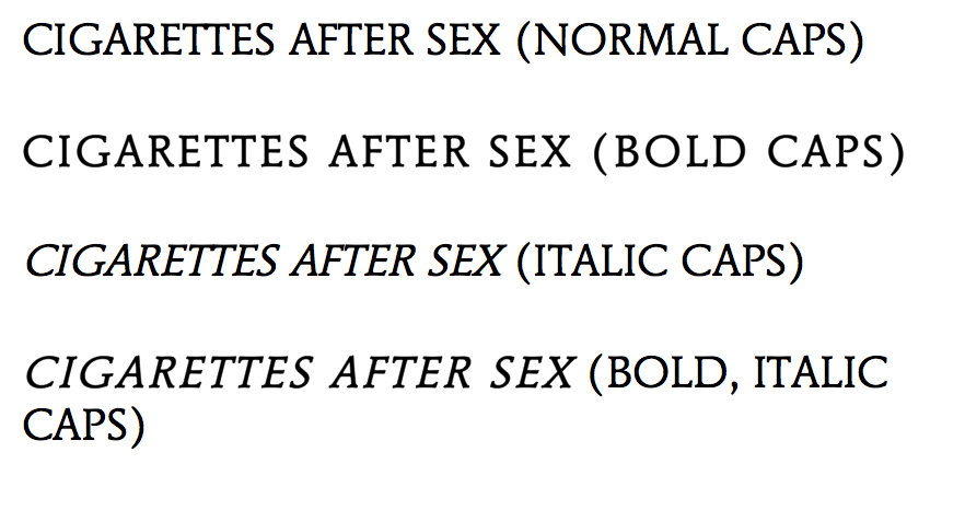
After the installation, I then started to play around with the font on Word; changing it from italic, to bold, to a combination of both - all in an effort to see which style of font worked best.

I deduced that the most effective way of utilising the style of font would be to keep it simple: just normal caps. Although, the idea of using the bold caps adds my own style to the DigiPak. In no way am I just being "lazy" and copying the actual style of font used, because as I've said, I want to maintain the band image and that continuity of the relationship between the ancillary products - so having a completely mis-matched font would be inappropriate. Ergo, I am justifying my reason for utilising the same font and same font style. However, in order to continuously develop my products, I will explore the standard font style, as well as the bold font style and decided which one is more effective - who knows, it may turn out that the bold would be the most effective, but for now, I am rigid in my intention of conveying the  continuity between my products and  the image of my band.


Further Inspiration and Exploration

Aside from finding the actual font used, I decided to broaden my options in terms of appropriate font styles. I took to a well known font website called "DaFont.com" and began my search there.

As I am sticking closely to the image and genre of my band,  I only focused on fonts that could potentially add to the "dream-pop" and grungy appeal - for example, Typewriter fonts.

The first font that I found, '1952 Rheinmetall', is a Typewriter font that hones in on the grungy appeal of the band. I did like this font as it is in keeping with a simple Serif style that ties in nicely with the overall aesthetic that I am trying to convey, and I will keep it in mind for the development of my ancillary products - however, I am not entirely sure I am convinced by it because of the minute gaps in the lettering. Although, it's not a huge problem, but when trying to put together a cohesive and professional looking product, you would tend to stray away from any unnecessary gaps such as this.

In keeping with the genre of 'dream-pop', I researched alternative, "groovy" fonts that could potentially be appropriate for the DigiPak and magazine. I found a font called "Neon 80's", a style that has curved and smooth edges and is a Sans-Serif font. Overall, I almost like this look as it fits in well with the surrealist spin on the 'dream-pop' genre, but the font almost echoes a playful and jolly feel - something of which I am not really looking for. The band are known for their brooding tunes and if I were to use this font, I believe that audiences would get the wrong impression of the genre and the music itself. Without the Serifs on the lettering, it takes away from the edgy appeal of the band - again, something that I do not want to happen. However, on a positive, I love the continuity of the font - it is absent of any gaps (as compared to the font above) and offers smooth lines that could be appealing for the audience.

I moved on to explore the different types of font relating to the "Script" and Calligraphy category, in an effort to see the effect that widely alternative fonts could have in adding different meanings to the way in which the ancillary products are received.


Having thought I had found the most appropriate font style in "Bernadette", I quickly discovered that this isn't the look that I am going for at all. The font is too illegible and doesn't offer audiences ease when receiving the product. It doesn't work because the band name needs to be in all caps - this is to again, maintain the grunge-like appeal of the band, lowercase wouldn't necessarily work as it would look "too soft" for the image.

Alternative Typewriter (Inspiration).

As you can see, I was inspired to explore alternative Typewriter fonts to see if this was an angle that I was going to pursue in my development and exploration. Out of the two that I have evidenced, I am leaning more towards the 'Linowrite' font, as the 'Modern Typewriter' has an element of distressing - a feature that I am going to include on both the magazine and DigiPak - ergo, too much of this distressing element could look messy and inappropriate. Overall, I am going to stick with a font that has evidence of Serifs, as this small and subtle feature adds so much dimension to the cover - as my DigiPak and magazine shall not be "flat".


Friday, 6 January 2017

Magazine Advert Exploration


Cigarettes After Sex Magazine Exploration and Influence

As well as the DigiPak, I am required to complete another ancillary product that was either in the form of a homepage for a website, or a magazine advert. I have decided to complete a magazine advert in the chosen aesthetic for the secondary ancillary product.

Considering that Cigarettes After Sex are relatively new, searching for actual magazine adverts was slightly difficult, as they haven't been assigned to a major record label as of yet (they are a self-releasing band). However, I have managed to find posters that detail their Tour Dates that took place around the world last year and upcoming dates in 2017.

Aesthetically, the posters remain monochromatic; continuing on with the image of the band - simple, yet maintaining its "grunge" appeal. The one thing that I am influenced by is the simplicity of the posters, as the band have used continuity in iconography, such as the feather and hand; both of which have been used on album covers. If anything, in my final product for my magazine advertisement I will be keeping it relatively simple - yet captivating and presented in monochrome.

I really like the idea of the border that frames the poster, and I will experiment with and explore this feature as my development progresses. The reason why I am attracted to this feature so much, is that it adds a professional appeal; adding a level of quiet sophistication to the poster. When admiring the text of the poster, again, it is simple and sleek, but the actual band title is still in the same font over each poster evidenced in this post. Because of this, I will endeavour to find the actual font used by the band, or a font similar to it, and use it on my own product. Thus, continuously reflecting a relationship between each product (i.e. the DigiPak, music video and the magazine).

To the right, an element that I find works well is the transparency of the hand, as it acts as part of an overlay. In comparison to the poster above, there is no colour in the text. This is an element that I enjoy, but, for my product I feel like I need to have slight use of colour as this would then tie in the use of colour that I have used in my music video. However, this use of colour isn't going to be extreme, it will most likely be a subdued and dull colour, as not to detract from the image of the band or genre. My final product will take elements from each of these posters, such as the use of coloured text, the font choice, the simple overlay, monochromatic colouring and the border - to name a few!

A feature that must be apparent on my poster is the use of a barcode or a QR code. Using a QR code is a simple way for a modernised audience to connect with the band and/or social media accounts that relate to the band. However, that being said, I still want to bring out the authenticity of the band, and considering that their music isn't necessarily "modern", the QR code doesn't entirely reflect their "grungy" or "gritty" image. But, for the sake of a modernised world, the QR code could work really well. Again, I will obviously test and explore my options and determine which scanning feature would look best. The only issue that I see with using the QR code, is that because it is quite bulky, it could detract from the simplicity that I am trying to convey, but until then, I'm not dismissing the possibility of using it.

Aside from this feature, I will also need to include the publishing information, possibly information pertaining to where the bands music can be found i.e. on Amazon, iTunes etc., songs included in the album, ratings from other magazines (i.e. NME) and the album information and/or name.

Fundamentally, the main feature that is going to reel the audience in would be the title of the band, ergo, the aim is to make the title as obvious as possible, but not garish or inappropriate; because as I said earlier, they're relatively new, so the idea is to get the name out to mass audiences so that a major fan base can be established and fame can be gained.

Through researching alternative bands and their magazine adverts, I came across an advert for the band, 'The Verve'. The band are of similar genre and their music transcends into dream-pop and psychedelic rock. When analysing their magazine advert, it is clear that I can draw similarities between this advert and those for Cigarettes After Sex. 

Firstly, it is clear that they have chosen to go down the simplistic route by using a sepia toned photograph of the sky and just the title of the band and the best single from the album. The choice of different colours for the texts is relevant, as this would have been done so that the audience focus more on the name of the band than the text at the bottom of the advert. Choosing to have the bottom text in white, means that the audience won't be distracted from the bold text situated in the centre of the advert. This advert is evidence of how simplicity is sometimes the better option, in terms of engaging audiences, instead of bombarding them with information that they would more than likely skip over. Placement of the text is also very specific. Having the name of the band in the centre of the poster suggests (although a quite literal interpretation) that they want to be at the centre of attention and the band that you should be paying attention to. It also suggests the quiet and subtle confidence of the band, because by placing the name of the band in the centre, it suggests that they are comfortable with the position that they're in - in terms of fame. They're almost oxymoronically "loud" with their quiet confidence - but that's taking analysis to another level. 

They have strategically used the same font as seen on all of their CD's and the font that is specific and unique to their band. They've almost used the font as the iconography for the band, as this particular style of font is quite recognisable to their fanbase and any other audiences that may not directly engage with the band and their music. 

The choice of image is also very interesting, because if I were to relate it to the genre of music, the clouds and the sky evoke feelings of tranquility and ethereal power, as subconsciously, the audience could be led to assume that they could be the ones to experience these feelings if they were to listen to their music. Compared to Cigarettes After Sex, The Verve's advert includes the record label that the band is assigned to and how the album 'Forth', is available on vinyl. 

Ultimately, I have decided that simplicity is the best way forward and I will draw on elements from previous posters for Cigarettes After Sex, and experiment with different filters, such as the sepia toned photograph as evidenced in the poster for The Verve. However, as I want to create cohesion between all of my ancillary products, I am also going to transfer a distressed and etched look onto the magazine advert, as this is what will be represented on the DigiPak covers. 

Thursday, 10 November 2016

Audience Research


Audience Research 

This post will detail the gradual gathering of information starting by analysing the first responses I have collected. 

In order to gather adequate amounts of audience research, I utilised an online survey site to create my questionnaire. I chose the platform of an online survey as during this day and age most of the time spent by teenagers (especially my target audience) is online; thus making the process of collecting data quick and efficient.

My survey consists of 10 questions. The reason I stuck to 10 questions was because I wanted to gather precise and accurate representations/opinions of my intended audience demographic, and by having an overly long questionnaire, I lose the substance and information that I need in order to create a piece of moving image that strongly pertains to the audience demographic. In the first day that I advertised my questionnaire to my audience, I received 8 immediate responses. The minimum responses that I will allow is 15, the maximum is 25.

PIE CHART ANALYSIS - FIRST PHASE OF DATA COLLECTION
                                                                                 
The first question starts off simple by narrowing down which gender is more likely to be interested in listening to and watching an indie/contemporary R&B music video. I didn't send the questionnaire to anyone directly as this wouldn't have been an accurate way to gather my information; I published it on one of my social media accounts and I happened to receive exactly 50% male responses and 50% female responses. Whether this is due to chance or perhaps indicative of the interest of different sexes, is yet to be analysed.

As for the age, again, it is quite clear that my questionnaire has reached a 50/50 percentile as two age ranges are in exact opposition.


This isn't a concern at the moment as I haven't reached the minimum responses that I am aiming for. Again, because my song is a cover of a song by REO Speedwagon, I didn't expect the age demographic to be above the ages of 21, as the band that have done the cover of the song are a more contemporary band and marketed towards a younger demographic.


With my chosen genre already in mind, I gave my questionnaire participants a variety of genres to choose from, ranging from Folk to Heavy Metal in order to establish a real taste for the audience that are more likely to be interested in engaging with a text that is influenced by the Indie genre. Upon first observation, it is evident that my participants are more interested in the Hip-Hop genre with a 25% response rate with Indie/Indie Rock coming in second with a 12.50% response rate. However, as this is early days and I do not have the amount of responses that I wish to have as of yet, I am not worried in being deterred from creating a music video based around the Indie genre.


As I presumed, the majority of the participants are interested in seeing a music video with a clear narrative instead of being of didactic purpose and purely conceptualised. This is a great start as this is what I intended to do with my music video; follow a narrative that conveys the relationship of a married couple and it's gradual progression.

Considering that the original track is influenced by the Indie genre; I asked the participants which R&B artist and Indie artist they are more likely to listen to.

Not noting the genre of which the artist performs under was somewhat deceitful, but I utilised this strategy because I wanted to see what genre (through the artist) the audience would be more attracted to without any external influences of genre; I wanted their honest opinion, and honest research is the best way to get precise data to use to influence your product, which in my case is my music video. It is interesting to note that there is a healthy balance between R&B and Indie responses with The Weeknd being an R&B artist that gained a 25% response rate and The 1975 also gaining a 25% response rate. I don't put these responses down to popularity of the artist as I included artists that are extremely relevant to the 21st Century music industry. The reason why I included R&B artists was because although I am not using an R&B track, I am however utilising some of the codes and conventions found in their music videos. I am drawing most of my inspiration in terms of filming style and editing style from Bryson Tiller's music video for Exchange, where as I mentioned in a previous post, the music video utilises low-key lighting and a host of frames that are shot and edited in slow-motion: a feature that will be included in my final product.

PIE CHART ANALYSIS - PHASE TWO OF DATA COLLECTION (REACHED MINIMUM RESPONSES)


Compared to the first phase of data collection, it has become apparent that the age range has significantly changed as more responses are from a teenage demographic. This is a great response as my intentions are to market my music video at this demographic.

For my gender response, I obviously appeased more to a female demographic, as the response rate for female to male is 60:40. This will be very influential as my music video is intended to suit more to a female audience based purely on the fact that the song is in itself a love song, and the music video shows the progression of a relationship.


However, with this in mind, it has also become apparent that although females are the demographic that are going to influence my music video, I am not dismissing the possibility that a male audience are going to engage with my product, nor an older male demographic - this then fits with my idea that older audiences are going to interact with my product because of the relation to REO Speedwagon and their already established fanbase.
As I reached the minimum responses of 15, it has become apparent that there has been a shift in interest of genre. It is reassuring to see that the genre that has gained the most favouritism is Indie/Indie Rock, as this is the genre of which my chosen song conforms to. Here, I am specifically looking at the segment of the pie chart that relates directly to the responses pertaining to the genre of contemporary R&B and Indie/Indie Rock.

This is because as I previously stated, the song is an Indie Rock song, whereas my music video is going to be influenced by codes and conventions from the R&B genre. There is a response rate of 40% for Indie/Indie Rock and a 16.67% response rate for Contemporary R&B.
At the minimum response mark, audiences, like I wanted, responded to this question by declaring that
they would rather see a clear narrative in a music video, rather than a conceptualised piece or a video with a didactic purpose, however, this follows closely behind.

A clear narrative leads by 6% as a didactic purpose answer sticks at 40%. These responses so far are heading in the direction that I would like them to, as my intention of my music video is to follow a narrative. I believe that as I collect more responses, my audiences will be more inclined to vote for a clear narrative.
The responses that I have accumulated in terms of artists that audiences would rather listen to isn't as surprising as I expected. Considering that I used 21st Century artists to gather my information and all of them are relatively well known, I have concluded that it isn't due to popularity (as I previously thought it could be - further analysis subverts this idea), it is merely due to the audience taste. What is interesting to see is that audiences are more inclined to listen to an Indie/Indie Rock artists than a Hip-Hop artist.

This information will help me when creating my video as I can use this data to influence my final product, in the sense that my video will follow suit to a range of different codes and conventions from the Indie and Contemporary R&B genre. These codes and conventions will be influenced by The Weeknd's brooding videos and The 1975.

Finding out how often my audiences watch music videos will aid me in how to market my final product. Based off the information gathered from the artist that they are more likely to listen to, I will do further research into what music video that particular artist released recently on YouTube, for example. Then, I can gauge which video is the most popular by looking at the total YouTube views.

It is interesting to see that the majority response is that my audiences tend to watch less than 10 music videos a week, nevertheless, this information has a varied range of responses that offer data that can influence my final marketing scheme.


Considering that the 21st Century is ripe with politics and turmoil, I found it only necessary to include a question determining the political stance of my audience demographic. With help from YouGov.co.uk, I was able to see that there is a correlation between the genre of music, the artist and the political views of the audience that determines what music they listen to. The majority of responses gained were from people that live in Ilkley - a town that prides itself on being notoriously left-wing in the younger demographics - I cannot speak for the older generation as I don't wish to falsify findings. Having lived in multiple countries, I have been fortunate to have gathered responses from countries in which I've lived in the past - Bangkok and Dubai. As I can single out responses answered from a single person, it is interesting to note that my friends from Bangkok and Dubai are mostly centre-right and centre, with a few not having any political opinion.

FINAL PHASE OF AUDIENCE RESEARCH ANALYSIS (25 RESPONSES REACHED)


As I reach the final stages of my audience response analysis having gained 25 responses, the responses for the genre of Hip-Hop overtook the responses for Contemporary R&B, however, Indie and Indie Rock still remains as one of the top genres to listen to. With this in mind, I won't tailor the product to suit the codes and conventions of a Hip-Hop video as my intentions are to completely win over the audience that are going to engage with my product through creating a stellar music video for a song that doesn't actually have a music video yet.

My idea still remains the same in the fact that I will utilise codes and conventions from the genre of R&B, even if the song is an Indie Rock song.


As I suspected, my audiences are more inclined to engage with a music video that follows the structure of a clear narrative, rather than seeing a video with a didactic purpose or conceptualised.

However, this doesn't mean that I couldn't explore other alternatives for the narrative of my music video, as I feel that if I limit myself in this way, it would prove for an unsuccessful product - something of which I have no intention of it being.
In a great turn of events, The Weeknd gained more responses as I reached my 25 maximum mark. It leads with a 25% response rate compared to The Wombats and The 1975 both having a 20% response rate. I am pleased with how this question was answered as this is what I wanted to happen, now I am positive in how I am going to market and direct my final product as to satisfy my audience demographic demands.

Using influences from two genres will allow for more scope when exploring the effect of certain elements in my video, I can then evaluate these features in the video through the filming and editing process. As for the other artists, they were merely there to 'test the waters' for other potential influences - however, they didn't gain enough response rate to be a dramatic influence on my final product - hence, I shall still with the three artists that have been most engaged with.


As my responses progressed, there seemed to be a lull in female responses, however, this isn't a major problem, it does however slightly alter how I market my DigiPack and the overall layout and corresponding themes. This will be done to tailor more to a male demographic, whereas the video is mainly directed at a female demographic, the DigiPack design will be a compensation for the potential lack of interest in the music video from the male audience.

These results don't worry me in the slightest and I'm confident that I will try and reel in a male demographic with the alterations to the DigiPack design.

Gathering responses concerning the political stance of my audience have changed, as although a left-wing demographic still takes the lead, centre-right and right-wing caught up just barely. It is interesting to see that the majority of my audience are left-wing, this correlates well with the genres that were chosen - Indie/Indie Rock, Hip-Hop and Contemporary R&B. These genres are typically associated with lyrics that speak of drugs, sex and misbehaviour, topics of which aren't usually recognised by right-wing political parties, as they tend to promote more "familial values". Left-wing politics and music correlate well as artists that perform under this political stance are more likely to have a creative outlet and speak freely through their songs and lyrics.
This accumulation of research has been imperative as it has aided the direction of which I will market, produce and complete my final product, based off audience demographic research. Overall, I have determined that my target audience based off this research will be:

- Targeted at 17-20 year olds, whilst also trying to target older audiences that may engage with a cover of the song, originally performed by REO Speedwagon
- Targeted at both male and females, but altering the DigiPack design to reel in more of a male demographic

Video Production:

- Influenced by codes and conventions that conform to the genre of Dream-Pop/Indie
- Follow a strong, clear and concise narrative to meet the demands of the audience


Tuesday, 1 November 2016

Music Video: Final Concept


Music Video: Final Concept

General Narrative and Plot

My final decided concept for my A2 music video follows the intimate relationship of a married couple over the 18 years that they have been together. The music video focuses on various elements of their relationship, such as nostalgia when recollecting their own youth, the family they have created and raised, and the connection between the two and the eternal love shared. Structurally, the video will be filmed through a complete cyclical narrative: showing the start of their lives and then finishing with the current stage in their life. The narrative follows the couple recollecting their past through their own handwritten love letters and photographs, symbolising the bond that they so deeply share with each other. However, in order to stay true to the lyrics, there will be a loose relationship between the visuals and lyrics by showing the distance that the couple sometimes face, but in the end, they always come back to each other. The video opens with a slow-panning shot of a fireplace and photographs of the couple when they were younger and in contrast, the video ends with a secondary shot of a fireplace but then pans to photographs of their engagement, wedding and their children. The video, in essence, is a tribute to everlasting and undying love.

Song Choice

The song that I have chosen to create a music video for is "Keep On Loving You" by Cigarettes After Sex. It is important to note that the band, Cigarettes After Sex, covered this song that was originally performed by REO Speedwagon. I believe that this will act as an advantage as this allows for a wider and older audience demographic to be interested in my music video, as REO Speedwagon is an American rock band that formed in 1967, thus meaning that there will already be an established fanbase. This will in turn, push an older demographic to listen to the cover of the song done by the American band, Cigarettes After Sex that was formed in 2008.


Location

Here, I have included photographs that I have taken of locations that are going to be used within my music video. The location of any music video is significant as it determines how well the overall narrative flows and establishes a relationship between the lyrics and the visuals (i.e. the setting). Staying local will allow me to take advantage of the beautiful heritage of Ilkley, and allows me to manage my time around other areas of my filming and production process; such as editing.

Considering that I will be filming through November and finished by the end of the month/early December, the trees on The Grove are laden with lights that illuminate the pavements, I will also take advantage of this as several frames of my footage will have these lights shown, in order to heighten the romantic mood of the video.


Aside from utilising the main town of Ilkley, I will also seek to film on the Moors for one of the more panoramic shots of the music video. The natural setting may pose some issues with lighting, because of this, I will seek to utilise an extra light source that will enhance the film exposure so the footage won't be dark. However, if this isn't as successful as I hope that it will be, I can always use post-production editing to enhance the brightness of the footage.


Mood

Even though I have changed my concept, my influences from other music videos and artists hasn't wavered. I am still very much influenced by The 1975's music videos as they show raw emotion of the band members and actors, whilst also sitting comfortably within the codes and conventions of an Indie music video. My music video will conform to these genre conventions, for example, through technical codes such as dark, brooding lighting. The post-production editing will mean that the footage is edited through slow-cuts, as apposed to quick-cut edits, although, I will not exclude quick-cuts entirely. In my first music video concept, I intended to have shaky camera work that would enhance the grittiness of the footage but also aid to the success of the overall narrative, however, since I have changed my concept, the transitions and filming will be stabilised as to provide a smooth effect, much to mirror the romantic mood.


The 1975 utilise Colour Psychology throughout their videos and considering that I will use their videos for a main influence from the realms of the Indie genre, I will also incorporate this ideology. However, it will not be my main focus, I will instead use more symbolic codes (such as a close-up camera shot of a fire - symbolising desire/love) to aid the narrative, the subtle use of Colour Psychology through post-production editing will only enhance my intentions.


Monday, 26 September 2016

Research for the A2 Music Video


Research for the A2 Independent Music Video

My music video for the A2 Coursework is going to be situated within and inspired by the 'Indie' genre, slightly transforming it from the original genre of the song and the artist; which is contemporary R&B. I would like to stray away from the original genre of the artist as I don't feel as if it would be appropriate for the narrative that I wish to translate to my audience.

CODES AND CONVENTIONS OF AN R&B MUSIC VIDEO


My music video for the A2 Coursework is going to be situated within the 'Indie' genre, slightly transforming it from the original genre of the song and the artist; which is contemporary R&B. Typically, in an R&B music video, the codes and conventions are strictly suited to that genre; barely drawing parallels between others. The R&B genre is usually associated with sensual lyrics, accompanied by provocative visuals in order to successfully pertain to it's genre. Because of the nature of the lyrics (which are usually targeted at teenage girls and women), male artists such as Chris Brown and Usher are usually shown in music videos as being topless; this is because the music industry would want to attract a larger female demographic considering that this is their primary target audience. The music videos are filmed in certain settings, such as the beach, a night-club, or the artists own home; this is a convention of an R&B video as more often than not, this is the "go-to" location.
  • Apparel for male R&B artists isn't too extravagant and is a subdued version of the hip-hop genre, for example, hip-hop artists usually don excessive amounts of gold chains and other jewellery, but in the R&B genre, this is kept to a minimum. 
  • Tattoos are also shown to be prevalent in R&B music videos, thus making it an expected code of the genre.
  • As far as characters that are shown in the music video goes, the narrative usually follows two protagonists: the male artist and a female companion. Usually, the male artist is shown to be serenading a female actor, thus reinforcing the strong relationship between the visuals and the lyrics. 
  • Camera shot types range from extreme close-up shots, mid-shots and tracking shots. Extreme close-up camera shots are utilised to display the element of performance, such as lip-synching, and emotion as observed by the artist in order to form a relationship between artist and audience. Tracking shots aren't necessarily included in all R&B music videos, however, they make it easier for the audience to follow the narrative and ensure that the narrative is kept succinct. 

In comparison, female R&B artists are usually seen in music videos to be wearing minimal, provocative clothing in order to appeal to the male demographic. Because of this, female artists are more often than not seen as an object of desire are are blatantly objectified; this would be to suit the music industry demand, particularly concerning the genre of R&B.

The hair and makeup of the female artist is one of the most predominant features that is shown in an R&B video; used primarily to exemplify the sex appeal that the artists are notoriously supposed to have.

As a general rule of R&B videos, the notion of 'sexuality' is heavily acted upon and is used as an overarching influence in order to appease certain demographics. Sexuality is the most common influence for R&B videos and songs of which it is heavily reinforced through particular codes and conventions such as clothing, or a lack thereof, and makeup.


CODES AND CONVENTIONS OF AN INDIE ROCK MUSIC VIDEO 


In an Indie Rock music video, mis-en-scene is imperative as it's main purpose is to sustain a clear, succinct narrative that the audience can easily identify. This may be achieved through a limited amount of props or anything that correlates or offers iconography pertaining to the band. Typically, the mis-en-scene of an Indie Rock video features gritty, low-key lighting that is used effectively to invoke certain moods and responses from the audience. High-key lighting will only truly be prevalent in a music video where there is a sub-genre being represented, such as Indie-Pop; stemming from Indie Rock. Below are examples of an Indie Pop video (note the high-key lighting, vibrant colours) and an Indie Rock/Grunge video (note the low-key lighting, sombre/dark tones).

Indie Rock videos are laden with performance elements, such as lip-synching or a wide-angle camera shot capturing all band members performing the song through mime. Camera shots are also a very important feature of an Indie Rock video, most of the time wide-angled and extreme close up camera shots are utilised to make the band members known to the audience and therefore solidifying the strong relationship between the artist and the respective audience demographic. This idea of utilising specific camera shots allows for the integration of Richard Dyer's Star Theory, whereby audience members are so connected with a member of a band (usually the lead singer) that they imitate the actions, clothing or beliefs of the artist. There are three elements to Dyer's Star Theory:

  • A construction - whereby the star is manipulated through the music industry and is dehumanised in order to relate to certain audiences; they are stripped of all human attributes and are "constructed" in a way in which the music industry can benefit from. 
  • A commodity - similar to "construction", a star as a "commodity" simply means that the industry or label that the star is signed to, will use them as a way of making profit; this will be again, manipulated by the industry as they follow trends in other areas of the media that they know will work and attract the most audience attention. 
  • An ideology - this pertains more so to the audience interaction, in which the star is used to promote an ideology, or represent certain social groups/causes that will in turn gain audience interest, and therefore results in a highly established and devoted fan-base whereby the audience of the certain artist will start to believe in the values and morals upheld by the star.

Location is an important aspect of an Indie Rock video as it typically features an urban environment such as dark streets or the city - I will specifically use The 1975's music video for 'Somebody Else' as inspiration for my setting as it features a dark, melancholia-inducing street.

Editing is also a key feature in Indie videos. Camera shots tend to be quick-cut rather than slow and smooth; this is with the intention that the editing and quick cuts mimic the up-beat tempo of the music.

Artist iconography that pertain to the band is somewhat important as it allows the audience to visually connect, and identify with the band. For example, The 1975 are associated with three rectangular shapes that feature on tours and even on album covers. Imagery associated with Indie Rock bands are that of guitars, drums, a vocalist, bassist and pianist (in some bands).


ARTIST PROFILE


Stephen Wrabel, most commonly known by his stage name 'Wrabel', is an American singer/songwriter based in Los Angeles that confidently prides himself on his virtuoso skills and ability to play numerous instruments ranging from the piano to acoustic guitar. After attending Berklee College of Music for a year, Wrabel left Boston and headed to LA to further pursue his music career in songwriting.


After spending time in LA, Wrabel was eventually signed to Pulse Recording under the occupation as a songwriter; this was the artists first major breakthrough into the music industry. Soon after this, in 2012, he was signed to Island Def Jam wherein he released his first single, "11 Blocks", which was supported and promoted by well-known artist, Kesha.

Currently, Wrabel is signed to various labels such as Island Records, Universal and numerous international labels such as Digital Distribution Turkey, Universal Music Spain and Digital Distribution Panama.

Having been assigned to so many international and national labels, Wrabel has released two albums, 'Sideways' and 'Ten Feet Tall'. Wrabel gained recognition from Dutch DJ Afrojack, who was so impressed by Wrabel's brooding piano ballad of 'Ten Feet Tall', the two artists ended up collaborating with each other under a co-sign. Afrojack released various remixes of 'Ten Feet Tall', this in turn increased publicity surrounding Wrabel's image and gradually increased his popularity, nationally and internationally.


AUDIENCE RESEARCH SURROUNDING ARTIST

Statistics concerning The Weeknd (YouGov.co.uk)
According to Twitter research, Wrabel has a 54% male following, with the majority race being within the Caucasian demog
raphic (77%). As for his female following, there is notably less with only 46% of his followers being female. Considering that the artist is so low-key, audience research is significantly limited, however, I was able to compare artists of a similar genre to Wrabel so I could gather an average of the demographics such as age, political stance, gender and interests. A similar artist to Wrabel in terms of genre would be that of The Weeknd, who is known for his brooding R&B tunes, much like Wrabel. A comparison that I can make from the two sets of research is that the female demographic is relatively larger than the demographic for male listeners of The Weeknd in comparison to Wrabel.
Abel Tesfaye, The Weeknd

Analytics from Twitter concerning Wrabel (zoomph.com)
Another interesting comparison of a similar artist in the contemporary R&B genre is Beyonce. Drawing similarities in audience demographic in terms of the gender that takes the most interest in listening to their music, the female demographic certainly reigns supreme in this category. By having these comparisons readily available from reliable websites, I can tailor the way in which I create my music video to fit to each demographic equally.


Considering that I've already established a solid narrative, comprising of a mixture of boys and girls, this will be easy for me to achieve as it relates more to an open audience, as to leave more scope for audiences to infer the narrative and story of my music video.


Statistics concerning Beyonce (YouGov.co.uk)

AUDIENCE PROFILE: Primary & Secondary target audience

My music video will pertain to a male and female primary audience demographic, sitting comfortably within the age range of 17-20 year olds. The reason I have my audience target age so high is because of the nature of the video; the visuals will entail age-restrictive content such as consuming alcohol and smoking, therefore it would be inappropriate to advertise "illicit" activities to a younger demographic. The secondary audience will be audience members who are actively engaged with the Indie Rock genre, whereas when advertising the song, which is a synth/R&B track, the secondary audience would be viewers are interested with the respective genre of R&B.

Wednesday, 21 September 2016

Music Video Analysis: Glass Animals - Gooey


Music Video Analysis VI: Glass Animals - Gooey

Australian director-duo, Lily Coates and Gavin Young, formally known as 'The Apiary', brought new meaning to an idiosyncratic, whimsical music video that relies purely on a conceptualised idea with their video for 'Gooey' released in 2014 by the Glass Animals.

RELATIONSHIP BETWEEN LYRICS AND VISUALS

As the narrative unfurls, it is evident that the lyrics bare no relation to the visuals whatsoever, but however form a compilation of varying shots that define it as being a highly experimental video with psychotropic exploration in which the lyrics haven't been taken literally to influence the cinematography. When inferring meaning from the lyrics, it seems to be a song dedicated to the naivety of youth culture and subtly references a potential relationship. Through an initial watch of the video, it became apparent of the varying statuses of characters throughout the narrative, these were shown through low-angled camera shots that empowered the character but disempowered the audience; with the close-up camera angles revealing the characters that were blatantly devoid of emotion. In essence, throughout the video, there is an underlying message that seems to pertain to that of a power struggle between the characters, this is justified with the myriad of low-angled and high-angled camera shots specific to each character and their status within the video. It is only until the narrative reaches a mid-point that I am able to identify that the conceptual stimulus of the video is that of the 'Seven Deadly Sins'; or it is certainly depicted in this way.

GENRE CHARACTERISTICS

As an Indie Rock band, the music video certainly encapsulates the 'indie' genre, with minimal to no reference to the rock genre. However, the video exhibits less conventional codes and conventions that pertain to the indie genre. As the video is heavily conceptualised, there leaves mass scope for anything creative to be represented through the visuals, and as previously stated, the narrative follows that of the cyclical, repeated journey of 'The Seven Deadly Sins'. A more blatantly evident genre characteristic that appertains to 'indie culture' is that of the high-key lighting that remains constant throughout the entirety of the video. A music video for the 'Indie Rock' genre would usually have an element of performing in it from the band, but 'Gooey' is devoid of any relation to performance and features none of the band members, but instead relies entirely on the actors to further push the narrative along; therefore this music video subverts the typical expectations of an 'Indie Rock' video. 

LOOKING/MODE OF ADDRESS

Considering that the band aren't featured in the music video at all, and it is heavily reliant on the actors, the looking and mode of address is kept to a minimum up until the very end where a wide-angled camera shot captures all of the actors sitting on a sofa looking directly into the camera. This is the only time the actors directly address the camera. Personally, I don't believe that this was done with an intention to distance the actors from the audience as the video is more of a compilation of frames that forms a didactic purpose; to educate the audience of the sinister, cyclical cycle of 'The Seven Deadly Sins'. Because of the lack of the direct address to the audience, theories such as the Uses and Gratifications model remain partially unsatisfied, however, the audience may use this music video as a form of escapism as the video offers a complex yet bizarre narrative to pique audience interest and solidify some sort of deeper connection with them; thus compensating for the lack of mode of address. 

REPRESENTATIONS

The music video for 'Gooey' offers various representations, all of which have neither outlandish positive or negative connotations, and doesn't reinforce a particular stereotype. In this sense, the video is void of prejudice and racial stereotyping, although this doesn't seem obvious at first, with several viewings of the video, I was able to infer that age, race and stature bore no relevance to how the music video was shot, and was evidently based on their acting and dancing abilities. 


However, a striking representation that if anything, promotes body positivity is that of the wide-angled camera shot of the woman laying on the sofa, completely naked. This doesn't necessarily pertain to the ideology behind Laura Mulvey and sexual satisfaction of the male audience but rather has two inferences. One being that the nakedness of the women suggests an essence of vulnerability, the second being that it pushes the narrative forward as she is depicted as being 'Gluttony' from 'The Seven Deadly Sins'. Although, this may be inferred as being insensitive and inappropriate, I believe that it firmly reinforces body positivity, but is also reflecting the narrative.

LINEAR OR CLOSED & NARRATIVE AND/OR CONCEPT? 

As previously stated, the music video for 'Gooey' is highly conceptualised and takes the audience on a journey of 'The Seven Deadly Sins'. The narrative is cyclical in structure as the video opens with various close-up camera shots detailing the process of the sinister cycle with a scientific and psychedelic twist. What is interesting throughout the video is the minimal quick-cut or even slow-cut editing shots, and however only entails around 4-5 quick-cut jump shots to further pursue the narrative. Panning and tracking shots feature heavily in the video, as a rigged camera follows the actors from room to room in an abandoned mansion. This idea of slow, panning and tracking shots emphasise the smoothness continuity of the deadly cycle of the sins. 

MIS-EN-SCENE

The music video allows for in-depth analysis and inference in terms of it's bizarre but unique mis-en-scene as it takes the audience on a psychotropic, free-flow journey. As briefly mentioned, the video essentially follows the evolution of 'The Seven Deadly Sins' and the repetitive nature of the concept. Wide-angled camera shots address each and every actor and defines their 'being' within the cycle; as the music video opens, the close up camera shots of the woman with gold embellished over her hands is represented as 'Greed'; this is due to the fact that 'gold' is usually associated with wealth and riches, and as the camera transitions into quick-edited shots, the making of the "essence" (the liquid) within the video is made by 'Greed' and passed on from person to person, hence, alluding to the idea that greed is capable of being felt by everyone and leads to the exposure of other sins. A panning, wide-angled mid-shot captures the younger girl representing 'Envy'. She has stolen the "essence" that 'Greed' created, and out of spite, passes it onto the man in red: 'Wrath'. Colour Psychology is yet again at play here, as the man donned in a red wrestling suit depicted as being 'Wrath', further reinforces that the colour 'red' more often than not connotes with anger or danger. Jealousy then transforms into anger, wherein the wrestler in red beats the man dressed in blue, whom is depicted as being 'Pride'. 'Wrath' eventually spits on 'Pride' which would be generally humiliating, therefore the wrestler in blue has gotten his pride hurt, and then turns to 'Lust'; the woman dressed in yellow, to boost his ego and forget about the misdeed of 'Wrath'. To further justify this idea of 'Pride' being affected by 'Wrath', the scene ends with a high-angled camera shot towering over the actor for 'Pride' but elevates 'Wraths' status with a low-angled camera shot. The woman representing 'Lust' leaves the man as soon as she gets what she wants from him; something that lust does is lead to instant gratification; therefore, a tracking shot captures the woman dancing as she exits through the door to enter another room where she meets the man representing the sin of 'Sloth'. A high-angled camera shot tracks the man depicting 'Sloth' as he wanders over to the woman on the sofa representing 'Gluttony'. Laziness and subdued attitudes is an instigator for gluttonous acts and the power of 'Gluttony' ends up acting as a fuel to power 'Greed' and her consumption of materialistic possessions.


The video exhibits constant warm hues complimented with high-key lighting but also outlines and exemplifies the battle of status and dominance between the sins by utilising scores of high-angled camera angles contrasted with low-angled camera angles; both of which are used in order to sustain a fluctuating narrative in terms of status. 

https://www.youtube.com/watch?v=IIA1XQnAv5s