Thursday 26 January 2017

Magazine Advert Research: Conventions, Functions and Analysis


Conventions, Functions and Analysis

For the secondary ancillary product, I have to produce an appropriate magazine advert that "sells" my band and the music video that I have created. In order to create a successful ancillary product, I have to undertake the appropriate research that will influence my own work. 


The general functions of magazine adverts are as follows:
  • To promote whichever artist or band they are representing
  • To provide mass audiences with visual stimulation and to be aesthetically pleasing or "eye-catching"
  • To sell the song or album that the artist/band has come out with
Aside from these general functions, magazines also have "stock" conventions that are put in place by designers to ensure that the functions are correctly and appropriately fulfilled and achieved:
  • The song or album title that the band are trying to sell and advertise - in order for audiences to actively engage with the advert and thus, the band, the ,magazine advert must ensure that the name of the song or album is blatantly obvious so that audiences know what product they would be purchasing. 
  • Release dates of said album or song - audiences must be aware of when they are able to start purchasing the album/song.
  • The artist/band name (this is imperative) - this feature is utilised so that the artist/bands are made known to mass audiences, which will consequently result in them becoming more well-known in the music industry.
  • The record label that the artist/band is assigned to - the record label logo could be indicative of the genre of music that audiences would end up listening to, if they so wish to engage with the band or artist. 
  • Information about the album - this is included so that audiences are made aware of the style or genre of music, as well as enabling them to familiarise themselves with the album and also the track-list. 
  • Where to purchase or download the album from - with advancing technology, audiences need to be made aware of the platforms that they can purchase the album from, for example, platforms such as iTunes or Amazon may be made readily available for audiences to interact with. 
  • Tour Dates (optional) -  I say this is optional because not every band may have set tour dates or they may not intend to start touring around major cities, but perhaps just advertise a new album or song. 
  • Reviews (optional) - reviews might be included to pique audience interest and "show off" the band and the reviews that they may have gotten from respected music industries, i.e. NME 
  • Social Media links/QR Codes - again, as the aforementioned point states, advancing technology enables audiences to access anything on a variety of platforms, so Instagram links or Twitter links may be included on the advert so that audiences can interact with the artist on multiple platforms
  • A main/central image - this main image should relate to the band or artist image so that it makes it easier for audiences to recognise their products in the future - should there be a repeating logo or image. 
Lana Del Rey - Born To Die

I have chosen Lana Del Rey's magazine advert to analyse and explore the expected conventions of an advert. Upon first glance, the most glaringly obvious thing that you are drawn to is the portraiture of the artist herself. 'Born To Die' is Del Rey's second studio album, so having herself central to the advertisement implies that she is trying to make herself known to potential audiences whilst making an impact on the music industry. Her retro-like image is readily apparent and could be a staple aesthetic for future albums that she releases. Another convention of this magazine advert is the obvious, bold text that identifies who she is as an artist. Again, this would have been done to make a statement and only reinforces the idea that she is trying to make herself known to a 21st Century audience. The album name, 'Born To Die', is also in a clear, bold font and immediately makes it known to audiences what album they would be investing their money in, and perhaps through the seemingly "depressing" album name, the genre of music could be considered somewhat melancholic or nostalgic. What is also apparent is the release date of the album: 30th January. Note how the font is in italic and is obviously more subdued and dainty compared to the font that is used for the artist's name and the album title. This may have been done so that it adds another dimension to the magazine advert - as by having all of the text in the same bulky and heavy font could have been a little dramatic and echoed a "congested' feel to the product. Looking at the bottom of the advert, the designers have included her website - allowing audiences to branch out when engaging with the product. The website may have merchandise that Lana has created and may also be another source for audiences to purchase the album. Colour-wise, the advert doesn't have any outlandish or garish colours - perhaps implying that although the artist clearly wants to make herself known, she likes to take the more subtle approach by using pastel blues and whites; complimented by a red lip which could become (as mentioned before) a staple image or part of her iconography. 

The Stone Roses

A second magazine advert that caught my attention was one for The Stone Roses. The most prominent convention on this advert is the band name that has been included in a gritty, bold and capitalised font. Bold and capitalised font usually has the most eye-catching effect on audiences and draws audiences to engage with the product. The overall aesthetic of the magazine advert is in keeping with the genre of music that The Stone Roses represent: rock and grunge. The paint splattered background reinforces the carelessness often associated with major rock bands and also adds a grunge-like appeal. Another convention included on the advert is the detail of where the album is available for purchase. The obvious logo for iTunes situated in the bottom-left hand corner of the advert makes audiences aware that they are able to download and invest money for the album through iTunes. A feature that was missing from Lana Del Rey's advert were the use of reviews from music industry institutions. It is clear that through the clever use of band badges/pins (which is in keeping with the genre of the band), the designers have placed reviews from 'Q', NME and MOJO on the product - which in turn coerces the audience to interact with the product and potentially purchase the album. They would have featured the best reviews on the advert for obvious reasons - one being that they want people to know that their music has been deemed as the "greatest debut album of all time" and persuades them that their music is worth the money. However, overall, I wouldn't have said that this was the best magazine advert that I've seen, although it did interest me. As I consider a wider context and a wider audience, the design may not be appropriate for piquing the interest of alternative audience demographics - purely due to the subdued and dull colours that are used. Perhaps digitalised colours and more contrasting colours would have proved more appropriate, although you could argue that this wouldn't be in keeping with the genre of the band. 

Monday 23 January 2017

Audience Feedback Podcast 3

Audience Feedback - Podcast 3

Retouches to the First DigiPak Design


Retouching the first DigiPak design

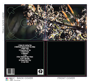
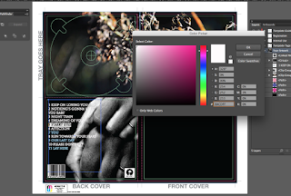
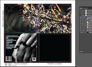
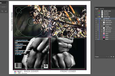
Going back into Illustrator, I knew that I had to add the copyrighting information, add the spine detailing and then change the record label. The previous record label, Island Records, was inserted to provide a general idea of the placement of the final record label - however, Cigarettes After Sex are assigned to Partisan Records. I inverted the colours as the original record label had a thick white background that looked "offensive" and clumpy. So, after ungrouping the white and the black layers, I deleted the white background and I was then left with the original black text. Obviously, the black text wouldn't work on the black background so I had to change it to white coloured text. The new record label design looked more simple and less "offensive" whilst also maintining my intended aesthetic. As you can see, the screenshot above shows the simple detailing of the spine. I didn't want to include a lot on the spine as I felt as if it would look too cluttered and again, randomly placed. So, by just having the name of the band on the spine completed the simple look and really tied the product together.


This screenshot includes the copyright information on the back cover of the DigiPak. I searched for examples used on legitimate album covers and simply changed it to suit my own ancillary product. Keeping the font the same as the rest of the text on the DigiPak maintained levels of cohesion and constantly shows how I am accentuating the strong relationship between all elements on my DigiPak - including images, text and feature placements.

Sunday 22 January 2017

DigiPak: First Stages

DigiPak: First Stages

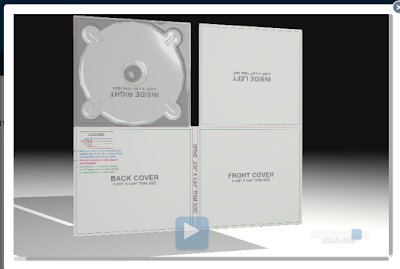
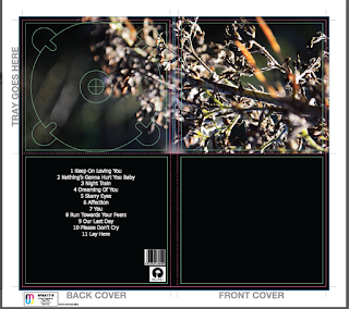
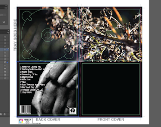
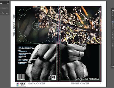
The first ancillary product that I have begun to create is the DigiPak for my chosen artist. To start, I downloaded a DigiPak template from the Internet using the site "discmakers.com". This template has the dimensions of a 4 panelled and 1 tray (4PAN1T) DigiPak and was a great starting point when it came to laying out my final design. I went into the creative process with the intention of bringing colour through the inside covers and using a monochromatic design on the outside so that it adhered to the aesthetic of my chosen artist - Cigarettes After Sex.


Once I had imported the template file into Illustrator (format AI), I went through the process of unlocking the text layers that came with the template. I then proceeded to delete these layers of text as I no longer needed them (Note the coloured text on the far left of the back cover). Once I had removed these extra layers of text, I had a clean template so I could start importing my images to use for my DigiPak design. Starting off, I drew a blacked out rectangle that would then act as a clean background that I could upload my images onto. The reason why the background was black is because the majority, if not all, of my images are darker toned and having a lighter backing image poses the risk of segments showing from behind the images if the images aren't adjusted and placed properly.
First Look

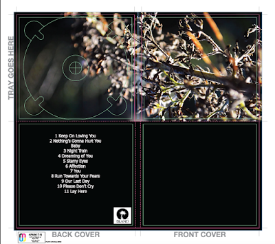
The image that I decided to use on the inside cover of my DigiPak design was taken from a still of my music video. Aesthetically, the image is one that exhibits my flair with depth of field photography with macro focusing - thus, when I opened it in Illustrator, the quality and resolution of the image didn't falter or decrease. The image shown stretches over the right and left inside cover areas because I wanted to create continuity within the design - instead of having two images that were broken up. Before importing the image into Illustrator, I opened the image in Photoshop (see previous post) and edited it according to the colours and hues that I wanted. I increased the shadows and saturation in the image and used a selective colour tool to pin-point certain areas of the branch that I could enhance without affecting the whole image.

Adding Barcode Vector and Record Label
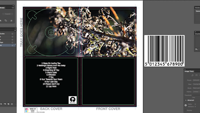
After I had placed the image for the inside covers into the document, I then proceeded to go onto the Internet to search for vectors of barcodes and record labels. The reason why you want vectors instead of standard PNG files is because vector files have higher resolutions, and the overall quality won't change once you resize the image. To resize the images, I held 'Shift' whilst I dragged the image to conform to the dimensions that I wanted. Holding down 'Shift' allowed for a more controlled resize of the images and would keep the contents of the file (for example, the numbers in the barcode) the exact size that I needed.
Barcode Vector Placed

Once I had finished resizing both the barcode and the record label vectors, I toyed around with the placement and tried to figure out which looked better. Originally, I had the two images on top of each other on the bottom right-hand side of the back cover. After gathering personal opinions from my peers, we all agreed that it looked a little cramped and didn't add an element of professionalism to the DigiPak that I want in my final design. So, with this in mind, I reworked the placement and decided that I would have the barcode on the bottom left-hand corner and the record label on the bottom right-hand corner. I believe that this placement looks great and as I move further into my development of the DigiPak, I will integrate the publishing information in between the two images - this is because I have seen this been done from my external research of other DigiPaks of major artists.

Playing around with placement
The placement of these two separate features are important as even though they are seemingly minute details to a DigiPak, they can help create an overall clean and professional aesthetic of the product. Every CD DigiPak has a barcode as this makes it accessible for purchase by mass audiences, however, based on the design, it can be altered and edited so that it conforms to the general aesthetic of a product. For example, a grunge/rock band may choose to have a gritty, broken or distorted barcode - but one that is obviously still legible and legitimate. I weighed the pros and the cons of having an edited barcode, but decided that keeping it simple would be the better option - as this generally conforms to the genre of my band and I didn't want to have a "warped" looking barcode and take the "Dream-Pop" genre too literally.

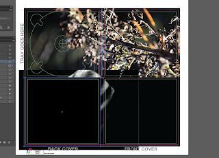
 Back image imported into the DigiPak Design - clipping mask
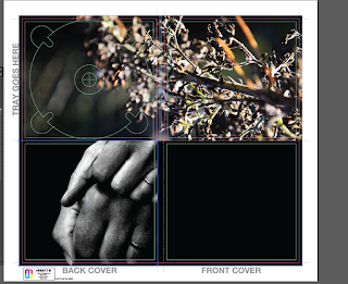
Moving on, I then imported the image of my parents' hands into the document to use as the back cover for my DigiPak. Because I already had a rectangular black background, when I inserted the image into the document, it was lost behind the rectangular shape. I also lost the text, barcode and record label that I had already applied to the back cover. To combat this, I right clicked on the image and pressed "Transform" and "Bring to Front" - this then brought the image in front of the black background, but I was still left with one problem - the text, barcode and record label was now under the image that I had imported. Before I made any changes, I had to resize the image by holding down shift (as to not lose the resolution or quality of the image) and applied a clipping mask using the rectangular drawing tool and the "Make Clipping Mask" option. The clipping mask essentially cropped the image but didn't distort the resolution of the image and once I had completed this action, I then repositioned the image so that it fitted perfectly with the dimensions of the back cover. After I had finished this task, I then realised that the barcode, text and record label was still missing, so I repositioned the image temporarily and right-clicked on each of the three features and clicked "Transform" and then again, "Bring to Front" - this action meant that these features would be on top of the back image.

Clipping mask applied - lost text and barcode
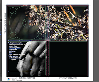
Once I had sorted this minor problem, I then started to tweak the positioning of the text; I centred it, sent it to the left and to the right. As evidenced, having the text centred over the image didn't look good and because the text was white and the image behind it is monochromatic, you lost some of the track list and it was unreadable. Having the text off-set to the left was better because there was a black area where the image had no object in it and the white text was easily readable. Despite the new placement working, there were some elements of the text that were slightly lost within the white areas of the back image of the hands. So, taking inspiration from the original tour posters of Cigarettes After Sex and the alternating colour of white and baby blue for the text, I decided to experiment with this.

Text fixed, but barcode remained behind image
But, before I could do this, I had to make sure that the barcode and record label image placement was in the correct place as they had moved behind the hand image. The reason why they had moved was because I had forgotten to lock the features - however, this isn't a massive mistake, as this shows that when you learn from your mistakes, you ensure your success in the future. So going back into tweaking the placement and arrangement of the two features, I brought the barcode and the record label image back to the front and repositioned them so that they were back in the original position that I had them in at the start of the process: off-set to the bottom left and right hand corners of the back cover.

Fixed text placement
Finishing up the new placements of the individual features, I then noted that I needed to put in the publishing information on the back cover. Until I have completed all of my final adjustments and edits to the main bodies and features of the DigiPak, only then will I add the publishing information. This is because I would rather get the main features completed and ready to go and proceed into the final editing process knowing that there isn't anything that I need to drastically change. I aim to keep the publishing information simple, succinct and professional looking - possibly adhering to the same font used for the track list and the band name on the front cover, as this would enhance the element of cohesion that is readily apparent in my ancillary product.
Final adjustments of back cover (w/o publishing info)

As shown to the right, a screenshot demonstrates my design in terms of the back cover of the ancillary product and the design choices that I made in order to create an effective and professional product. The final image sits perfectly on the back cover; as it highlights the wedding rings that I wanted to capture, as this highlights the narrative in my music video. Choosing a monochromatic image was done with the intention to satisfy the original designs done by Cigarettes After Sex and retains a strong relationship between their products and mine.


Altering font colour and placement

As I briefly mentioned before, the white text didn't quite satisfy what I was looking for, as it got lost in the white areas that are evident within the back image. Taking inspiration from the original album covers and posters, I decided to alternate the colour of the track list by having one line as baby blue and the other as white. I had to make sure that the tracks that were longer and bled onto the white areas of the photo were coloured baby blue and the shorter tracks were kept to the original colour. It wasn't a long or arduous process and it accentuated the level of cohesion that I am aiming for.
Alternating colours as to keep to the original album cover


Choosing the baby blue colour was actually a great decision as there are elements of a lighter blue shade within the edited inside cover of the branch. In turn, this emphasised the relationship between each and every detail on my DigiPak design. I am really pleased with how my design choices turned out and I endeavour to keep certain elements included in my final DigiPak design. Considering that one side of the back of the DigiPak is completed, I then moved onto designing the front cover. Again, I wanted to bring the element of monochrome through in my final design, so I inserted the second image of the hands into the document, to act as the image for the front cover of the DigiPak. 

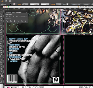
As shown below, the close up screen-shot shows how successful my design choices were as they worked well together and kept the simplicity of the design professional and cohesive. In terms of the font, I changed it to the original font used by Cigarettes After Sex: ITC Mendoza Roman Book SC. I used this font for the track list as well as the band name on the front cover, and as well as this choice in font, I also experimented with the capitalisation of the track list and found that all caps font works best as it matches up with the text on the front cover as well as the original designs. 

As I move on to the final stages of the first design, I followed the same procedures that I took for the back cover image in terms of utilising the Clipping Mask and Transforming tool. Although, the only thing that I did differently was flip the image so that it faced the other way, as the original was off-set to the same side as the back cover, and having the two images side by side looked ineffective and messy.
 
I then added the final text of the bands name over the top of the image that is situated in the bottom right-hand corner of the front cover. Admittedly, I did toy around with how the placement would look and even tried to rotate it so that it was vertical down the side with the most free space, but this didn't add anything to the design of the product and instead looked random and unprofessional. Looking to the spine of the DigiPak, I decided to insert the bands name there as well; as I felt that it would tie the whole product together, rather than having an empty black strip that added nothing to the aesthetics.

To conclude, the first experience with using Illustrator was very successful and I am extremely happy with what I have achieved. The first design is extremely close to how I want the final design to look, in terms of utilising the element of colour on the inside covers and bringing the monochromatic design on the outside covers. The simplicity of the first design works really well, and the images really carry the narrative of my music video - creating a sense of cohesion and solidifying the relationship between all of my products. 

If there was any room for improvement on my next design, it would be to experiment with more colour on the front colours, without detracting from my original intention of delivering a professional, slick and clean DigiPak, whilst also considering the aesthetic of the original band and their genre. But all in all, this first attempt of a final design is well-thought out and well put together; the next step with this design is to include the publishing information and the spine detailing.

Wednesday 18 January 2017

First Edits for the DigiPak

First Edits for the DigiPak

Edited using Photoshop
As I have completed my filming process, I have now started to consider a variety of options for my DigiPak and Magazine images.

In keeping with my intended idea of basing the designs on the original DigiPaks and Magazine adverts, I decided to go with a clean and sharp aesthetic, focusing on keeping a black and white image on the front and back of the DigiPak, and bringing colour through to the inside covers. This conforms with the overall aesthetic of my actual music video, as although the video is edited to suit more of a grungy and withered look (with the help from a Lumar Keyer filter), there are moments of crisp colour; especially when I capture the plants and leaves. There is a general motif of nature within the music video, as I capture a variety of shots evidencing my flair with depth of field - thus, I decided to explore the possibility of enhancing the colour of the separate photographs that I took during the filming process, showing the different plants and branches. To ensure that there is a continued relationship between my video and ancillary products, I believe that this will be a great option for me to pursue.

Original
As you can see, the top photo shows the edited photograph of the branch that features within my music video. To start the editing process, I opened the image in Photoshop, applied the Auto Correct,  Colour and Tone feature to it, and then went in with a tool called Curves. Using Curves allowed me to visually see the shadows and highlights that I was changing - as I was changing it, so that if something didn't look visually pleasing, I could change it immediately. I wanted to make sure that the colours were vibrant and obvious in the image, so I then went into the Channel Mixers and toyed around with the R/G/B channels to enhance the blues and the greens. The aim was to make the image stand out, but not to the extent that the colours all merged together, creating a messy aesthetic and not conforming to the sleekness that I want for my DigiPak images.

Edited using Photoshop
These edited photos proved successful, albeit these might not necessarily be the final images, they certainly pave the way for the direction that I am intending to head in ensuring a strong relationship between all of my products.

Again, I have included another example of what I am trying to achieve in my final product design. However, it is important to note that I am not just using this specific branch/plant for the exploration (these are used to show my first exploration), I will be using alternative images that I took whilst I was filming - this is in order to see which looks best and what aesthetic has the most effect. During this editing process, I went in using the exact same process with the auto correction, moving onto Curves and finally playing around with Channel Mixers. In order to see how each photo matched up in terms of the darks, the whites and the black colouring, I opened the Digital Colour Metre on my laptop to see if there was consistency throughout my editing. 

Original
It was great to see that there was consistency , as I feel as if there was an obvious deviation or difference, the images wouldn't have looked succinct and in keeping with what I am trying to achieve. Overall, I am trying to capture the vibrant colours as well as focusing on darker hues that would automatically enhance these colours. Bringing colour into the inside covers of the DigiPak is done with the intention to break up the potential monochromatic and dull feel to the ancillary product - this is something that I am not aiming towards! It is solely by using monochromatic images on the outside covers that I truly tie together the aesthetic of the band, the ancillary products as well as my music video. 

Monday 16 January 2017

Music Video Analysis: Daughter - Numbers


Music Video Analysis: Daughter - Numbers

Directed by Iain Forsyth and Jane Pollard, the music video for 'Numbers' is that of a conceptual piece that doesn't really bare any relation to the lyrics. Instead, I believe it is more of a social commentary of social identity and growing up in a modernised society - both commenting on how the world is cruel, warped and in some cases distorted, as well as commenting on how people exist through what they perceive to be as "perpetual pain". 

RELATIONSHIP BETWEEN LYRICS AND VISUALS

Overall, I could make no distinctive link between the lyrics and the visuals, purely because there were no objects or motifs that solely related to what the song entailed. However, with this being said, the concept of being "numb" was highly evident, as shown through a variety of wide angled and tracking shots that showed the lack of emotion of the lead actress, Natasha O'Keefe. Although the video is conceptual, there are elements of performance within the music video; as seen through wide angled camera shots of a band (the lead singer an old man, and the actual singer of the band 'Daughter', acting as a bassist) performing under brooding, low-key lighting. In this sense, I can make a link between the visuals and lyrics, as there is an obvious element of lip-synching: a convention of a performance style music video. 

GENRE CHARACTERISTICS

Upon first watching the video and already knowing that 'Daughter' is an ambient pop and dream pop group, the music video definitely conformed to the codes and conventions of the genre. For starters, the genre of dream-pop tends to add an element of subtle surrealism to any product. In terms of this music video having an element of "surrealism" to it, it makes the audience question things that inevitably evokes a response from audiences that force them to question the aesthetics of the video, as well as the deeper, perhaps didactic meaning of the product. As my aforementioned point states, the video draws heavily on how we live vicariously through a modernised society, constantly changing our personal identity to suit that of the agenda of the time - yet, we're possibly unaware of the damaging effects that it has on us. An obvious convention of a dream-pop music video is the vast amount of low-key, cool-hued lighting, that in turn evokes a melancholic response from the audience as well as suiting the overall aesthetic. In contrast to this, there were also moments captured within the video (exhibited through wide-angled and tracking shots) that showed neon, vibrant, high-key lighting that had a soft glow to it - reinforcing the genre convention of ambient-pop, as the soft glow of the neon lights added another dimension to the visuals, drawing the audience in and reiterating the atmospheric and brooding tone of the video. The directorial choice of not using quick-cut edited shots also conforms to the genre of dream-pop, as the smooth, continuous tracking shots reiterate a gentle flow throughout the video, adding continuity and allowing audiences to engage more with the genre of ambient-pop

LINEAR OR CLOSED NARRATIVE?

In this music video, there is a strong narrative that unfolds throughout the main body of the product - however, personally, it seems a little complex for audiences to fully engage with. The excessive amounts of enigma codes, such as the close-up shots of the deck of cards and the coin, pique audience interest, but makes them work harder in unearthing the narrative. Having watched the video numerous times, it is clear that there is a continuous narrative that flows throughout, but it is also a cyclical narrative, as it opens with a wide-angled camera shot of an apartment bedroom, and ends in the same way - suggesting that the narrative that the actress takes is both continuous and part of her twisted, deluded every day life. The music video is particularly interesting because as we follow the actress throughout the concealed streets of London, the camera directs our attention to several different people, such as the protesters, the homeless man and the woman that injured herself. In terms of a directorial choice, it could be inferred that the woman detaches herself from these things that she deems as "mundane" and unimportant - as she dismissively blows smoke into the faces of the protesters, lighting money on fire and tossing it at the homeless man and finally completely ignoring the injured girl. 

LOOKING/MODE OF ADDRESS

Deducing that the music video is in fact conceptual and isn't performance based, there is an absence of looking throughout the video, but only up until the very end where the lead singer of the band is shown through an extreme close-up and lip-synchs to the camera. Up until this point, the actress, Natasha O'Keefe, remains completely distant to the audience, showing her detachment through the same, nonchalant and emotionless facial expression. The idea of the actress distancing herself from the audience by failing to look directly at the camera, reinforces the message that I decoded from the video - she shows that she is perpetually numb and the lack of acknowledgment of the audience and camera, shows the lack of confidence that she has in herself and her personal identity. Perhaps, she also views the audience as being "mundane" and refuses to acknowledge us because of this - just as she did with the injured girl. 

MIS-EN-SCENE

Conceptually driven, the music video focuses on a girl and her struggle with personal identity and love in a world that does nothing but take from her, and only stresses that it is indeed a cruel world - as seen through the various other characters. The only way that she finds comfort in the world is taking from other people, hence the strong enigma codes of the deck of cards. Various close-up camera shots of the deck of cards, suggests that this is only a game to her; she is calculated and methodical in what she wants, and knows exactly how to get it. She seeks and she takes - relentlessly.  This is the only way to get back at the world from taking her personal identity from her. Considering that she dons a red, satin/silk dress, conjures up imagery of the stock character, the 'Femme Fatale'. Used in a lot of movies and music videos, the 'Femme Fatale' is typically depicted as a beautiful woman with bad intentions; usually to capture lovers. The element of Colour Psychology is again used here, with the colour red usually associated with love, danger, blood and death. O'Keefe searches for men to use and drain of life, with the death of the men happening right after she touches the deck of cards and the coin, and the men being drained of blood. The idea that she touches the deck of cards, shown entirely through high-angled close-up shots, suggests that she knows that she is playing a dangerous game, but this doesn't bother her, as she gets what she wants anyway. The video intimates that life is nothing but a game and a competition and suggests that life is fragile if put into the wrong hands.

The low-key lighting of the video allows for an emotive response from the audience as it follows the harrowing tone of the visuals. In terms of empowerment and disempowerment, there was really no inference that I could make here, as although there were no high-angled or low-angled camera shots of the main actress, it was clear that she remained in a position of power as she was the central figure-head in the music video. The only power inference that I could make would be that of the high-angled shot of the deck of cards and how the woman would always be in a position of power if she continued to play the game of life and death.


Saturday 14 January 2017

25 Marker Response: Representation


Applying the concept of Representation to my AS Media Coursework

For my AS coursework, I produced a three minute moving image sequence that was to be representative of a segment from a potential film. Representation is defined by the way in which the media portrays elements of society; and whether it is conveyed negatively or positively, the distribution of representations within a specific media platform is done through careful mediation.

Through a feminist interpretation, my AS coursework integrates Laura Mulvey’s “The Male Gaze” (1975) Theory into the fabric of it’s creation. This theory suggests that the audience, whether consciously or not, assumes the role of a male viewer and adopts a masculine perspective – regardless of gender. In my film, there are a variety of wide, high angled camera shots that are edited in a way that exposes the female protagonist as she is seen to be in her underwear and a t-shirt in a bath. The high angled camera angle automatically coerces the audience to assume a role of power over the character displayed within the film, and assumes a male perspective – regardless of gender. In addition, I utilised a panning and downwards tilt shot that displayed the female protagonist and her body as I “looked her up and down” with the camera lens. This is congruent with Mulvey’s theory as I was unintentionally objectifying her by displaying her body in order to satisfy a male audience.

The representation of the male protagonist reinforced the archetypal characteristics of a ruthless and merciless vampire figure, as evidenced through a wide angled camera shot that shows his determination to attack as he runs through the street. As the narrative progresses, I soon subvert the ruthless characteristics associated with the stereotype of a vampire, and direct his character so that he exhibits compassion. This is evidenced through an extreme close-up camera shot of his mouth where he delivers the line, “bite someone to pass it on, then you’ll be free”.

My moving image was produced with the intention to satisfy a Western audience, as the narrative follows the supernatural and the fantastical. Filming in Dubai meant that I had to be sensitive and respectful, as the culture doesn’t recognise the supernatural; however, the male actor in the film was of Middle Eastern descent and didn’t oppose to the idea of being involved. From a hegemonic interpretation of my moving image, it is through an enigma code that highlights the wealth of the female protagonists family as a close up camera shot displays an heirloom encrusted with diamonds: further signifying the old money associated with her family. This segment of footage highlights the power of her family and how they exercise this power through cultural influence, rather by force.

Orrin Klapp (1962) argued that there is a distinction between social types and the stereotypes. Klapp defines a social type as an entity that exists within the realm of social norms and values, whereas in comparison, a stereotype is a figure that exists outside society. This is relevant to my moving image as there is a clear transference of this notion between the two characters. The male character in my moving image is depicted as a stereotype as he is an “unknown, supernatural entity”, therefore existing outside the realms of the socially accepted cultural norms. He then regains the position of a “social type” when he transfers the characteristics associated with the stereotype onto the female protagonist; who was at first, a social type. The audience in this case may relate to the female protagonist who had those archetypal characteristics projected onto her. In this instance, it would mean that she would become the villain, and because the audience would have already related to her whilst she was depicted as the “social type”, this transference of characteristics would then evoke sympathy from the audience. 

As my moving image is founded upon the convergence of three genres: fantasy, supernatural and horror, it appeals to a wider audience demographic. It also relates to the Uses and Gratifications Theory, as through the fantastical representation of the male protagonist as a vampire and supernatural creature, it offers audiences a form of escapism as reiterated through the notion of “simulacra” and Baudrillard’s Theory (1998) of “hyper reality”. The idea of “simulacra” is that it exposes simulations of reality that replace the real world and the way in which it operates; in reference to my moving image, the depiction of a supernatural entity is entirely simulated through an alternative, imaginative realm, but is then projected onto reality to appease to a Western audience. The way in which my product displays this idea is through the use of various camera angles, such as the opening where I use a wide-angled mid shot to capture the aggressive stance of the omniscient character; then transitioning to an extreme close up camera angle of his hands as they morph into an exaggerated and twisted position.

To imitate the ideology surrounding O’Sullivan’s (1998) theory regarding gender and how it is conceived primarily through language, the vulnerability of my female character is evidenced through  an extreme close up camera shot of her face as she says “What do you want, what do you want from me?”. The desperation of the female character is blatant through her language and audiences can infer that she is in fact helpless within the situation; therefore reinforcing the stereotype of female characters being represented as the “damsel in distress” in horror or thriller films.

My moving image sequence presented many alternative representations and conformed to the structures and ideologies of relevant theories. It can be inferred that throughout my moving image, representations of specific characters can change throughout the unfolding of a narrative and are not bound by specific characteristics, unless it is the director’s intention, and in my case, it was my intent to provide alternative and changing representations but still have sections where I depict the archetype.


Mark gained: 
A*, 23/25

Friday 13 January 2017

Quick Update: Finalising Filming


Quick Update: Filming for the upcoming weekend - 14th January 2017

In light of the recent weather in Ilkley, my filming process has been somewhat stunted and I was unable to film due to icy conditions - making it unsafe for both me and my cast members. However, this weekend seems ideal to gather my final 50 seconds of footage. 

I will be travelling down to the River Wharfe near Ilkley Park and gather some more transitional and character footage in order to pursue the final sections of my narrative. 

The plan for the weekend is as follows:


I am aiming to complete all filming on the 14th of January, as I would like to have my product completed before the February Half Term. This ensures that during this holiday, I will have time to plan my evaluation responses, compose first and second edits of my DigiPak and Magazine advert and gather audience feedback and responses. 

Sunday 8 January 2017

Typography for the DigiPak and Magazine


Typography

Choosing a font for any purpose is integral in shaping a way that the text is received by audiences. So, my font selection for my DigiPak and magazine is no different. Ultimately, I want to sustain the relationship between each and every ancillary product that I produce, but also relate it back to the image of the band. 

Firstly, I took to the Internet and conducted a font search because I was adamant that I want to use the actual font that my band use on each of their products; especially the font used on their album covers.  I found a website called "WhatTheFont.com" and ran an image through their font database. The website then isolated each letter (I filled in the letters that were unable to be recognised) and then I let the search run it's course. After about 30 seconds, I am greeted with a screen that displayed five fonts that were closely matched to the original image that I had uploaded.

Honestly, the five fonts looked exactly the same and didn't really have much difference to them. So, choosing the first font that came up (because naturally, I assumed that the first would be the closest match - I was right!) I then perused the Internet yet again for a source that would help me to download the font - as my Microsoft Office account didn't have the font installed. 

I found a very helpful website that allowed me to download the font for free, and after much reconfiguring with my Microsoft Office account and Word, I finally installed the font 'ITC Mendoza Roman Book SC'. 


After the installation, I then started to play around with the font on Word; changing it from italic, to bold, to a combination of both - all in an effort to see which style of font worked best.

I deduced that the most effective way of utilising the style of font would be to keep it simple: just normal caps. Although, the idea of using the bold caps adds my own style to the DigiPak. In no way am I just being "lazy" and copying the actual style of font used, because as I've said, I want to maintain the band image and that continuity of the relationship between the ancillary products - so having a completely mis-matched font would be inappropriate. Ergo, I am justifying my reason for utilising the same font and same font style. However, in order to continuously develop my products, I will explore the standard font style, as well as the bold font style and decided which one is more effective - who knows, it may turn out that the bold would be the most effective, but for now, I am rigid in my intention of conveying the  continuity between my products and  the image of my band.


Further Inspiration and Exploration

Aside from finding the actual font used, I decided to broaden my options in terms of appropriate font styles. I took to a well known font website called "DaFont.com" and began my search there.

As I am sticking closely to the image and genre of my band,  I only focused on fonts that could potentially add to the "dream-pop" and grungy appeal - for example, Typewriter fonts.

The first font that I found, '1952 Rheinmetall', is a Typewriter font that hones in on the grungy appeal of the band. I did like this font as it is in keeping with a simple Serif style that ties in nicely with the overall aesthetic that I am trying to convey, and I will keep it in mind for the development of my ancillary products - however, I am not entirely sure I am convinced by it because of the minute gaps in the lettering. Although, it's not a huge problem, but when trying to put together a cohesive and professional looking product, you would tend to stray away from any unnecessary gaps such as this.

In keeping with the genre of 'dream-pop', I researched alternative, "groovy" fonts that could potentially be appropriate for the DigiPak and magazine. I found a font called "Neon 80's", a style that has curved and smooth edges and is a Sans-Serif font. Overall, I almost like this look as it fits in well with the surrealist spin on the 'dream-pop' genre, but the font almost echoes a playful and jolly feel - something of which I am not really looking for. The band are known for their brooding tunes and if I were to use this font, I believe that audiences would get the wrong impression of the genre and the music itself. Without the Serifs on the lettering, it takes away from the edgy appeal of the band - again, something that I do not want to happen. However, on a positive, I love the continuity of the font - it is absent of any gaps (as compared to the font above) and offers smooth lines that could be appealing for the audience.

I moved on to explore the different types of font relating to the "Script" and Calligraphy category, in an effort to see the effect that widely alternative fonts could have in adding different meanings to the way in which the ancillary products are received.


Having thought I had found the most appropriate font style in "Bernadette", I quickly discovered that this isn't the look that I am going for at all. The font is too illegible and doesn't offer audiences ease when receiving the product. It doesn't work because the band name needs to be in all caps - this is to again, maintain the grunge-like appeal of the band, lowercase wouldn't necessarily work as it would look "too soft" for the image.

Alternative Typewriter (Inspiration).

As you can see, I was inspired to explore alternative Typewriter fonts to see if this was an angle that I was going to pursue in my development and exploration. Out of the two that I have evidenced, I am leaning more towards the 'Linowrite' font, as the 'Modern Typewriter' has an element of distressing - a feature that I am going to include on both the magazine and DigiPak - ergo, too much of this distressing element could look messy and inappropriate. Overall, I am going to stick with a font that has evidence of Serifs, as this small and subtle feature adds so much dimension to the cover - as my DigiPak and magazine shall not be "flat".